How to Curate Photos for Your Author Brand & Website
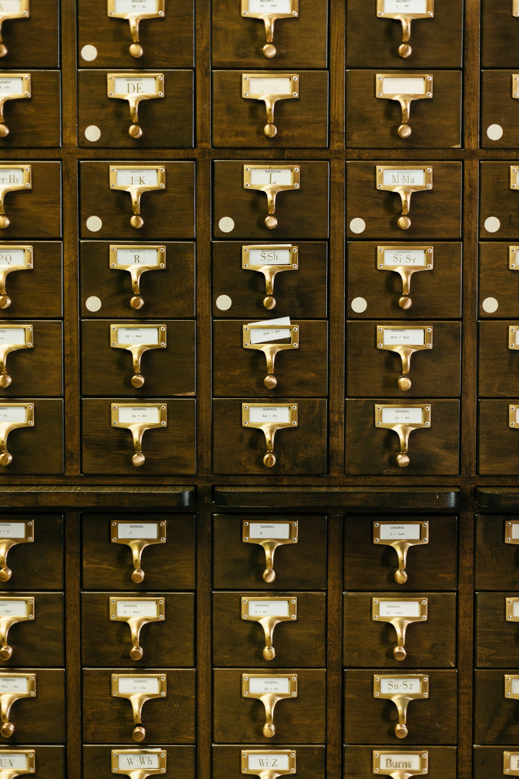
The images you choose for your author website set the emotional temperature of your brand. In addition to being pretty, your images allow your reader to form a feeling about who you are and what kind of stories you write—all before they even read a word. Think of your photos as the first impression you leave your reader with, a little calibration that tells them what to expect and whether they want to stay a little longer.
Your photos are another form of storytelling.
The right image can make your website feel romantic, haunted, intimate, cinematic, eerie, soft, lush, restrained, or whimsical. The wrong image can make your brand feel generic, disconnected, or visually forgettable—even if the writing itself is beautiful.
This is why I prefer to curate photos slowly and intentionally. I’ll usually gather a few dozen images before I decide which ones actually belong. The extras rarely go to waste. They often become social media graphics, newsletter headers, blog images, mood board material, or inspiration for future endeavors.
Photo curation gives your author brand a visual language. And when that language is clear, cohesive, and emotionally aligned with your work, your website starts to feel less like a digital business card and more like an invitation into your world.
Best Free Stock Photo Websites for Author Branding
There are so many stock photo sites available, but I tend to return to a few dependable places when I’m helping authors shape the visual direction of their website or brand.
Dupe Photos
Dupe Photos is especially helpful when you want alternatives to images that feel overused.
Some stock photos circulate everywhere. You see the same typewriter, the same coffee cup, the same moody forest path, the same person reading in the same sunlit window. While there’s nothing inherently wrong with those images, they can make an author website feel less original.
Dupe Photos helps you find less-traveled photos. It’s a useful place to look when you like the mood of a popular image but want something that feels a little more specific or unexpected.
Use it when you want your author brand to feel familiar enough to be legible, but distinct enough to be remembered.
Unsplash
Unsplash is still one of the strongest free stock photo libraries for high-resolution, artistic photography.
It is especially useful for cinematic images: dramatic light, atmospheric landscapes, detailed interiors, beautiful textures, and wide shots that work well for website banners. If you’re building an author website with a strong mood—romantic, gothic, literary, speculative, cozy, or emotionally intimate—Unsplash is often a good place to begin.
Because the library is so large, keyword choice matters. A broad search like “writer” or “books” will usually return predictable images. But a more specific search (think things like “foggy garden,” “green velvet chair,” “old library shadows,” or “wildflower field sunset”) will usually give you something far more aligned with your brand.
Keyword Search Is Crucial
Even within the same genre, subgenres require completely different visual storytelling.
This is where many author websites start to look too generic. Someone writes gothic romance, so they search “gothic.” Someone writes fantasy, so they search “castle.” Someone writes cozy mystery, so they search “books and tea.”
Those searches may give you something usable, but they probably won’t give you something specific enough.
Your goal is not only to represent your genre. Your goal is to represent your version of the genre.
A romantic gothic author, a haunted gothic author, and a horror gothic author may all share certain aesthetic roots: old houses, shadowed rooms, antique textures, candlelight, fog, roses, lace, decay. But the emotional promise is different.
One invites yearning.
One invites unease.
One invites dread.
The keywords need to reflect that difference.
Gothic Brand Keyword Examples
Gothic x Romantic
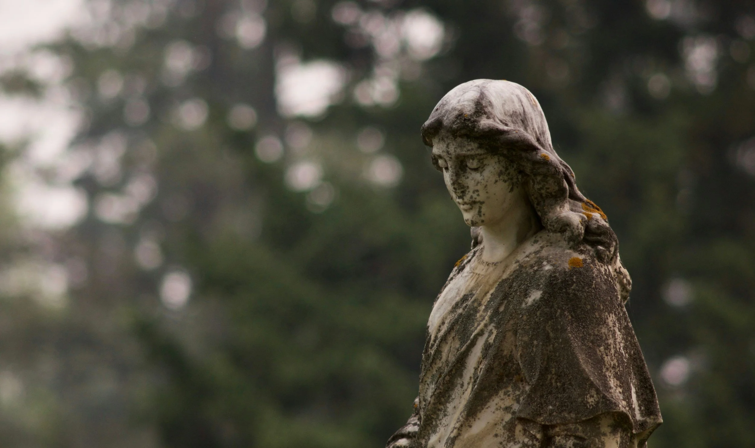
The vibe is moody elegance, tragic beauty, yearning, antique luxury.
This version of gothic imagery should feel lush and intimate. The darkness is present, but it is softened by beauty. Think love letters hidden in drawers, roses just past their bloom, velvet curtains, candlelit rooms, and the ache of waiting for something.
Search keywords we might explore (mix + match and see what you find!): vintage lace, dying roses, candelabra, dark academia, foggy estate, classical statues, old love letters, romantic vanity, pink garden, pink graveyard, candlelit room, antique perfume bottle, silk ribbon, rain on window
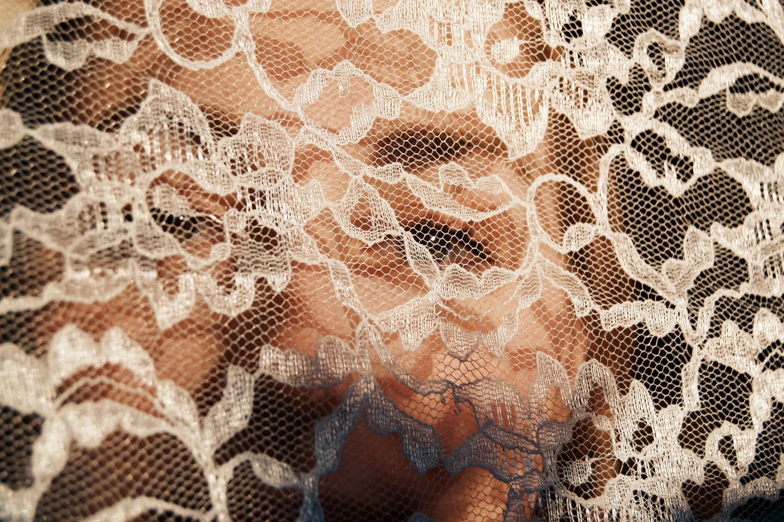
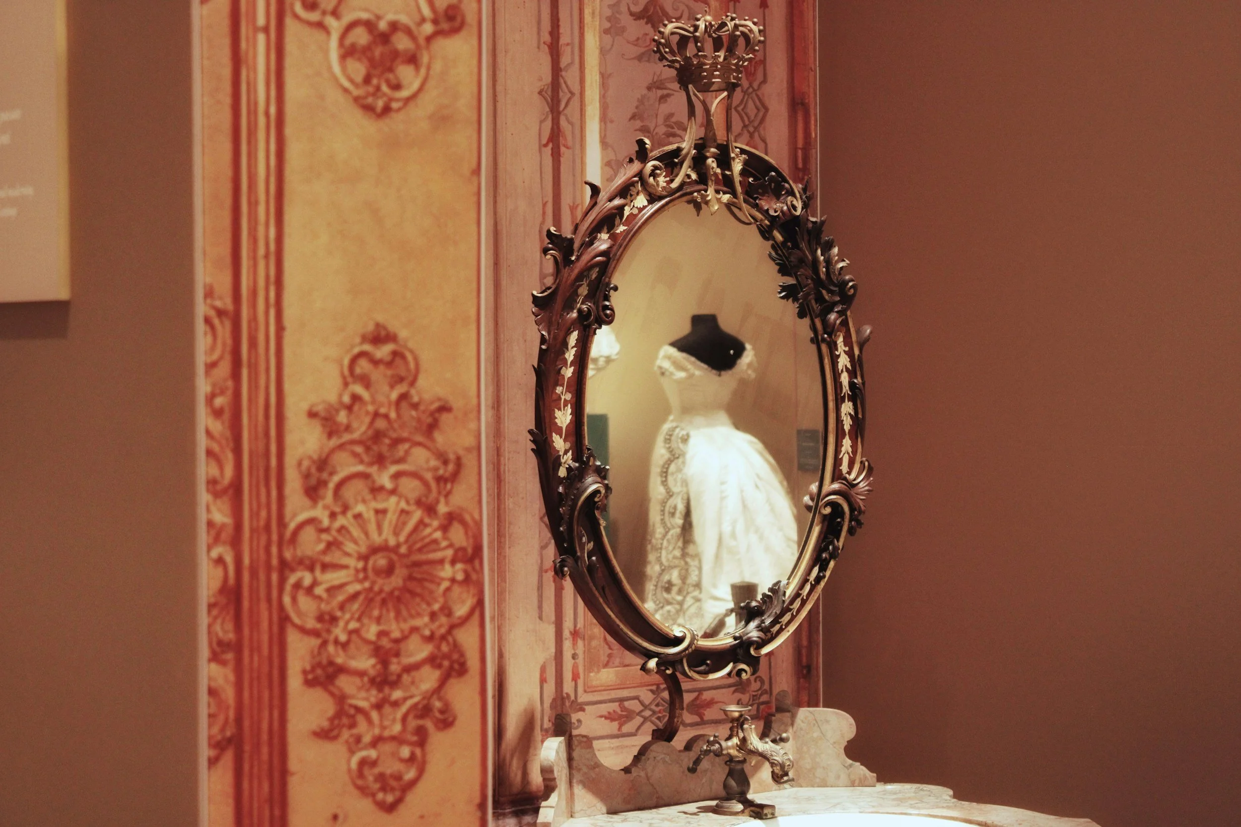
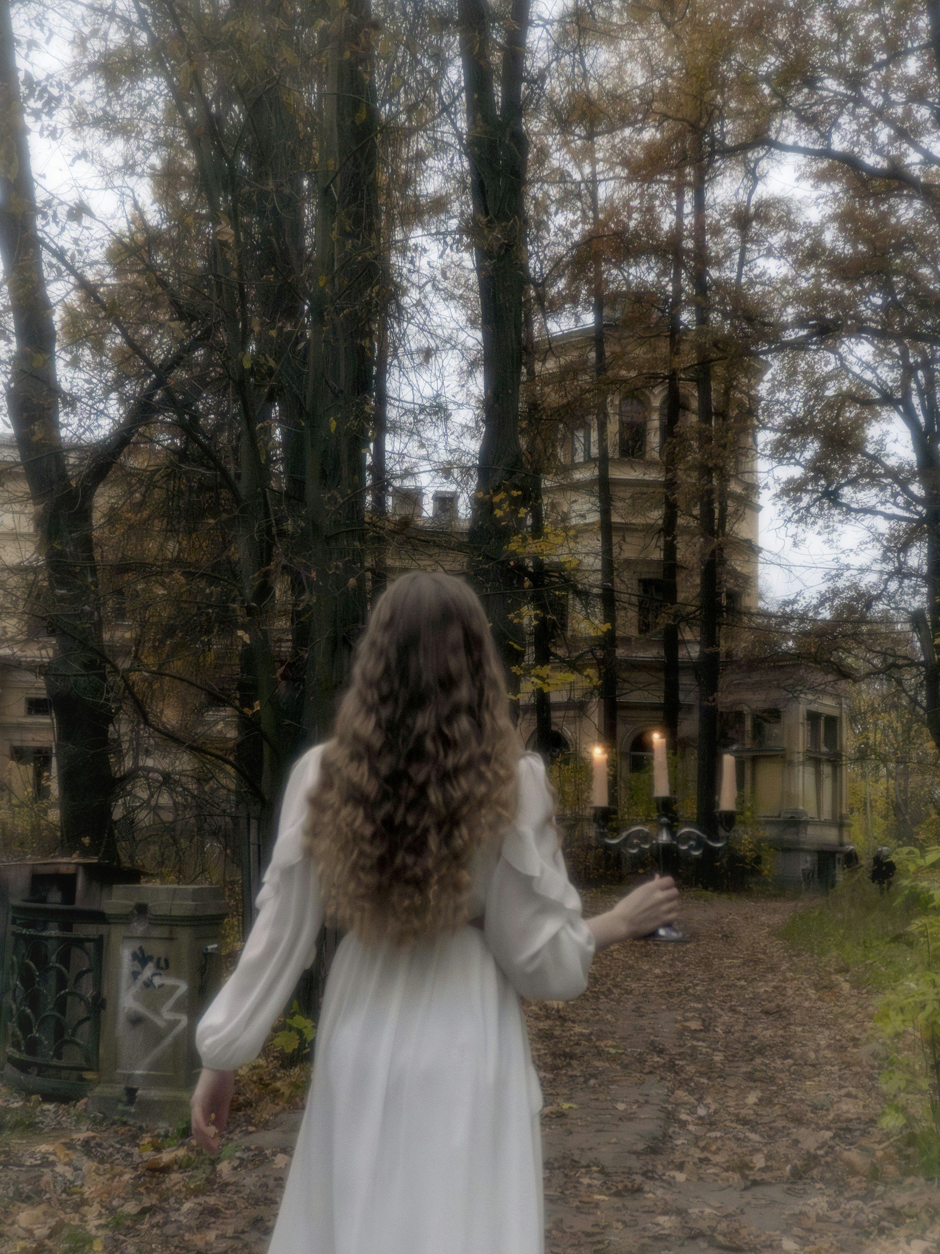
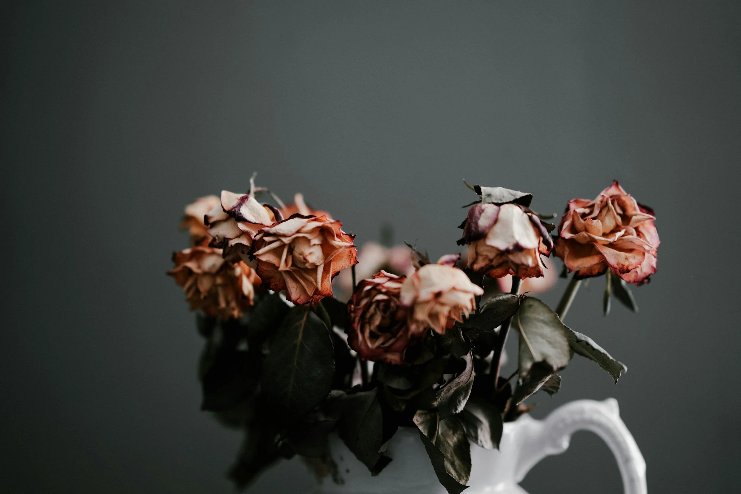
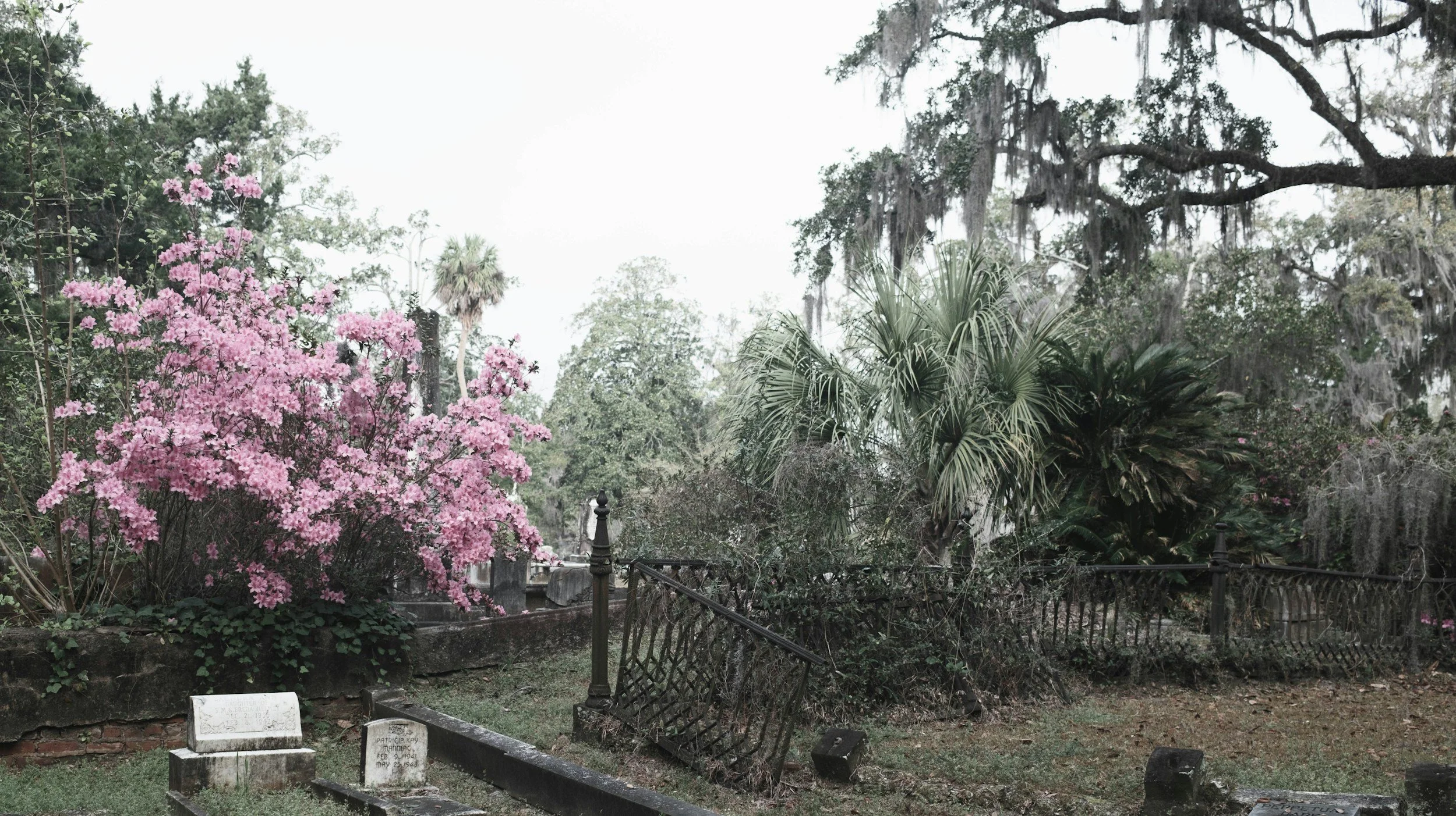
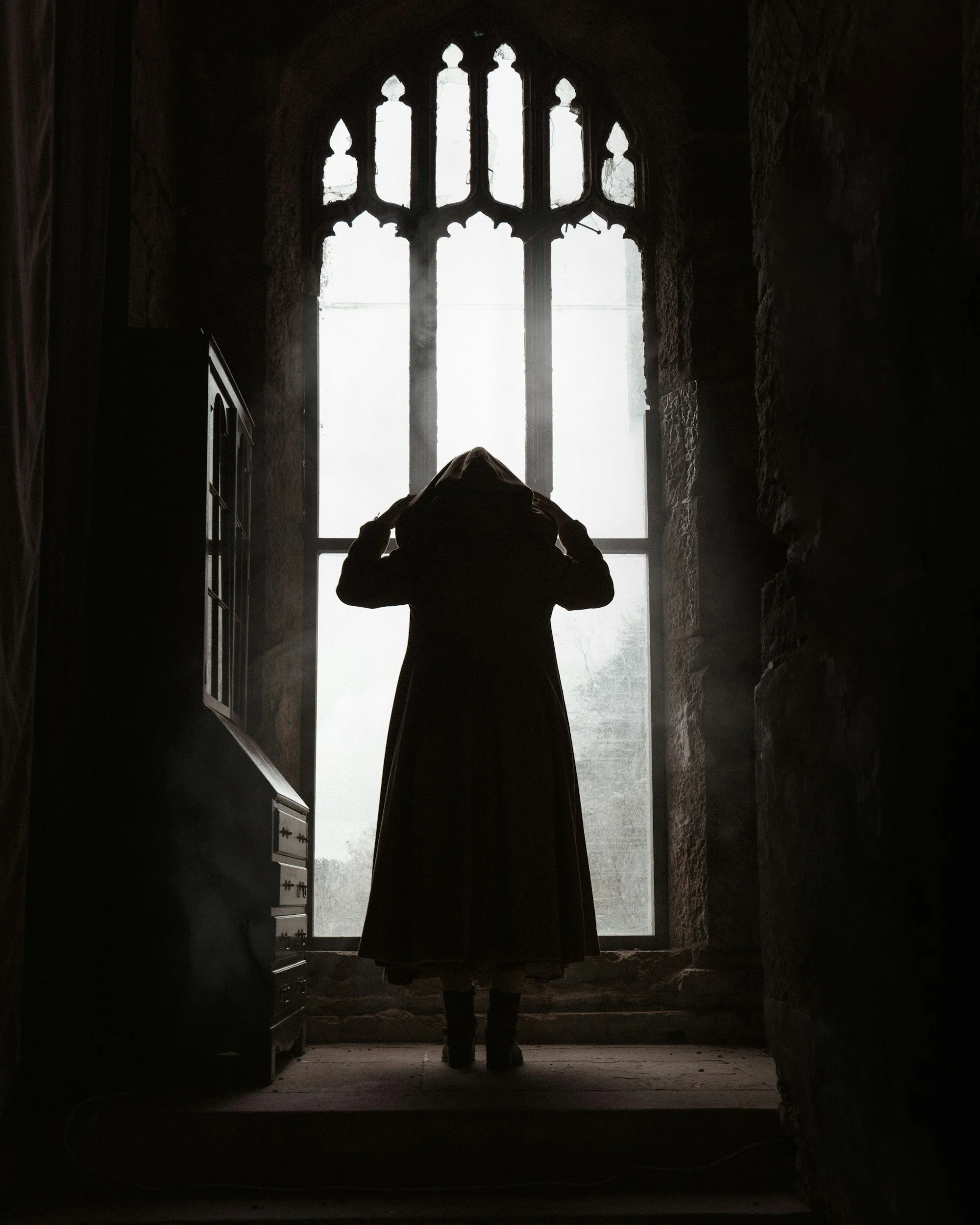
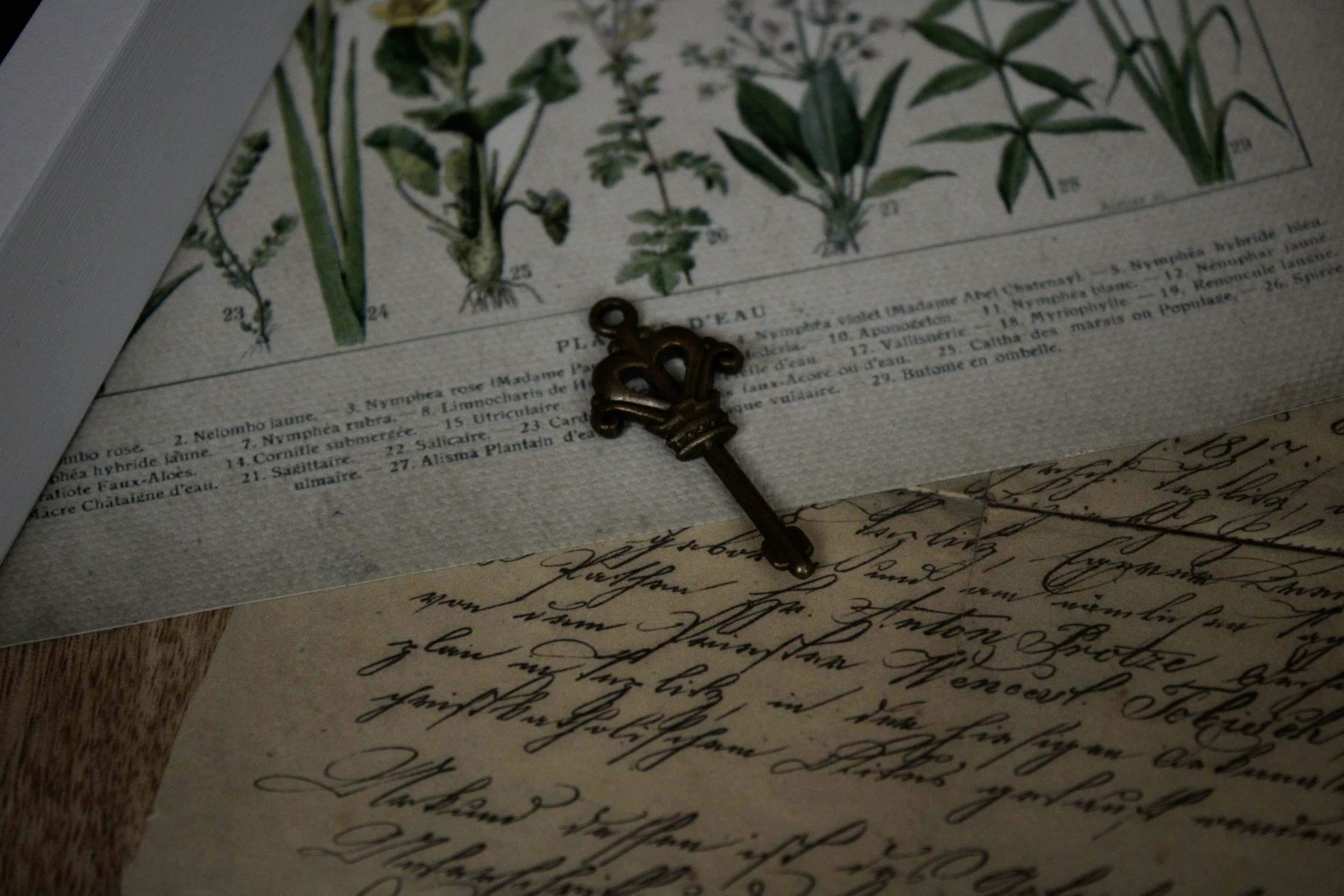
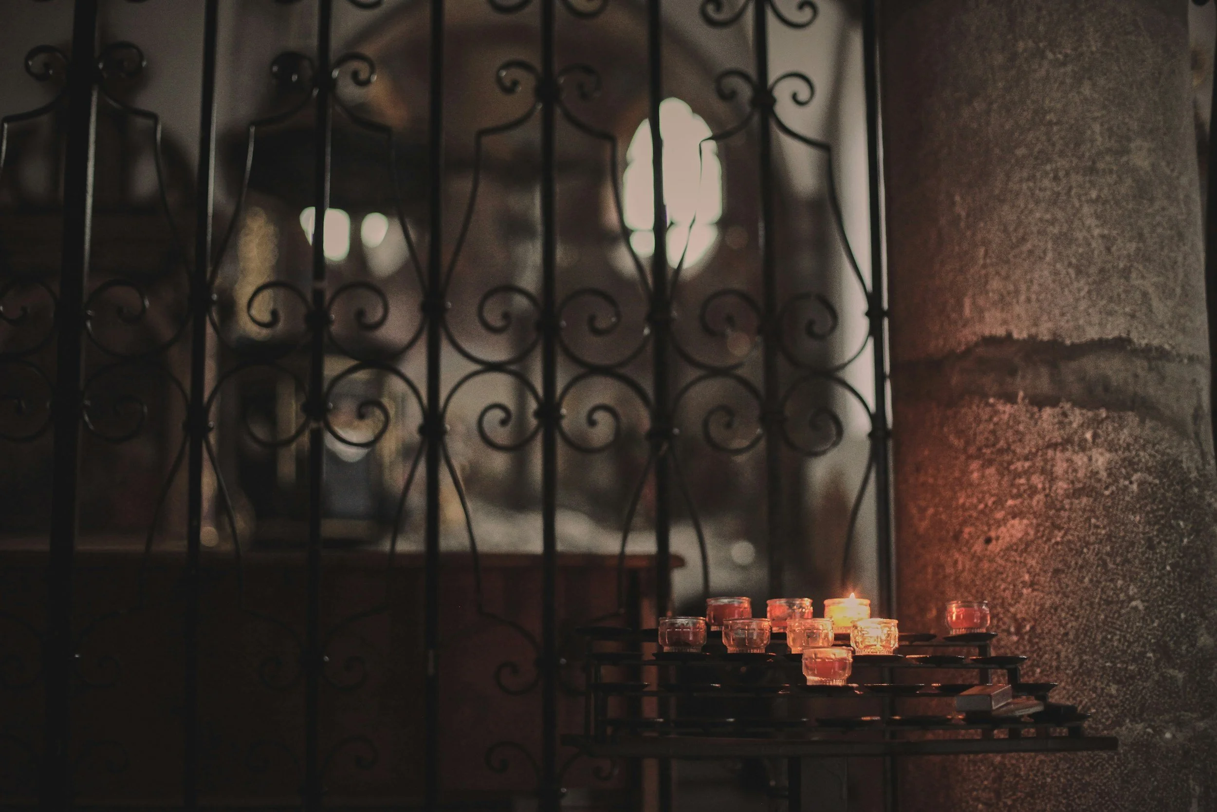
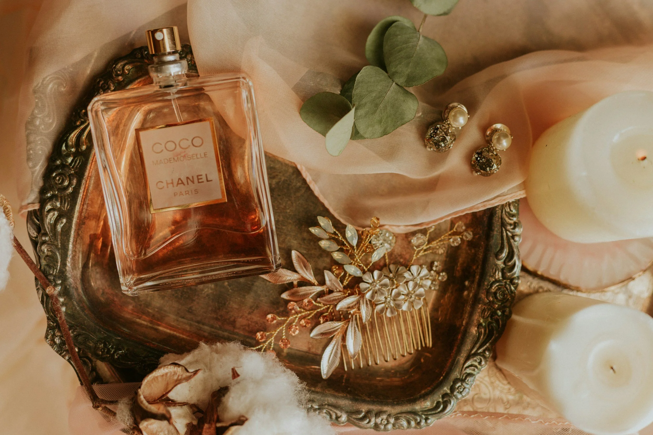
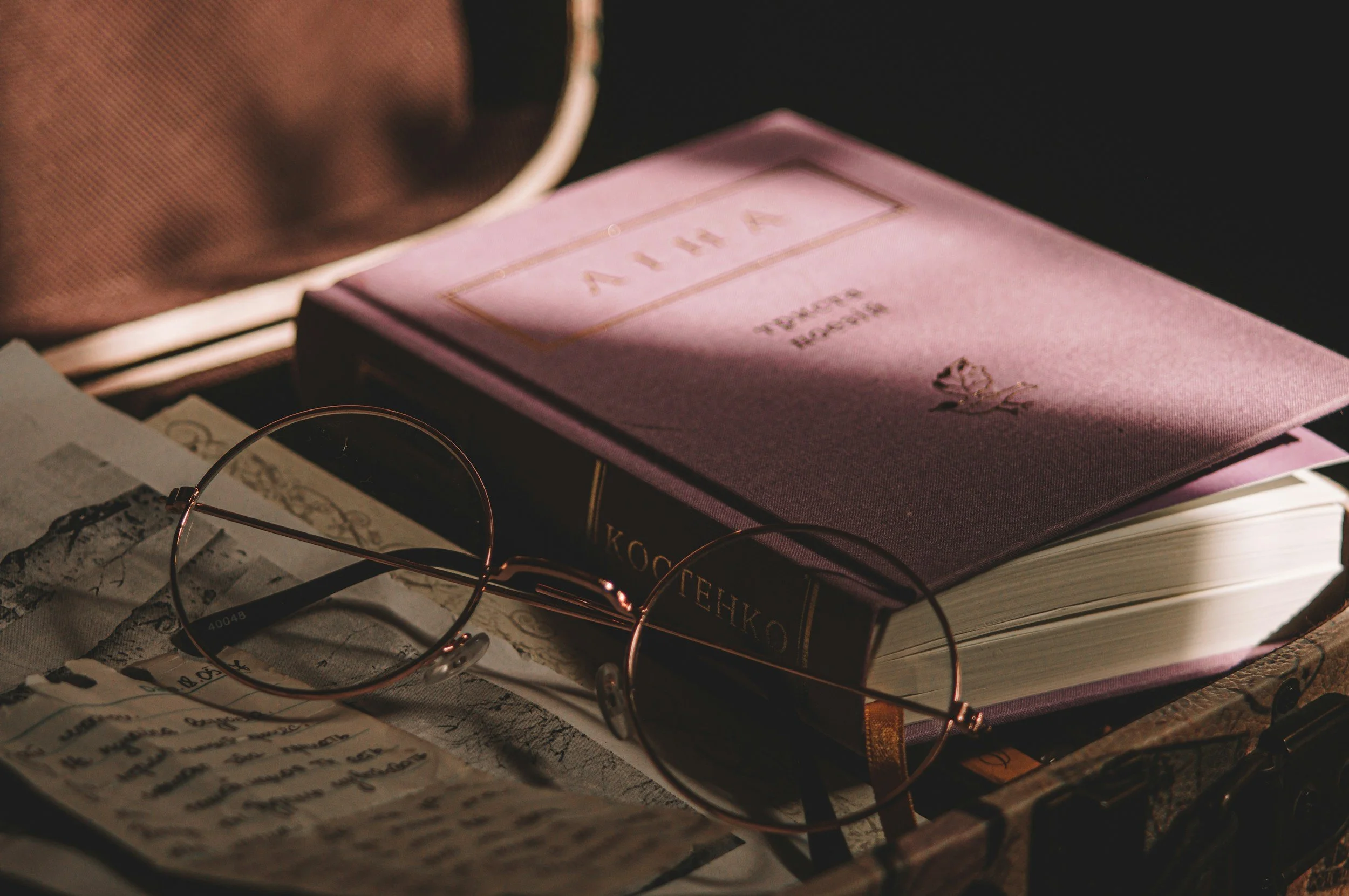
PS: Sometimes one photo does carry the full mood you intend. But often, the feeling of a brand emerges through a collection: the lace gives softness, the dying roses give decay, the candelabra and vanity gives old-world romance, the graveyard gives atmosphere, the perfume bottle gives intimacy, the estate gives scale.
Gothic x Haunted
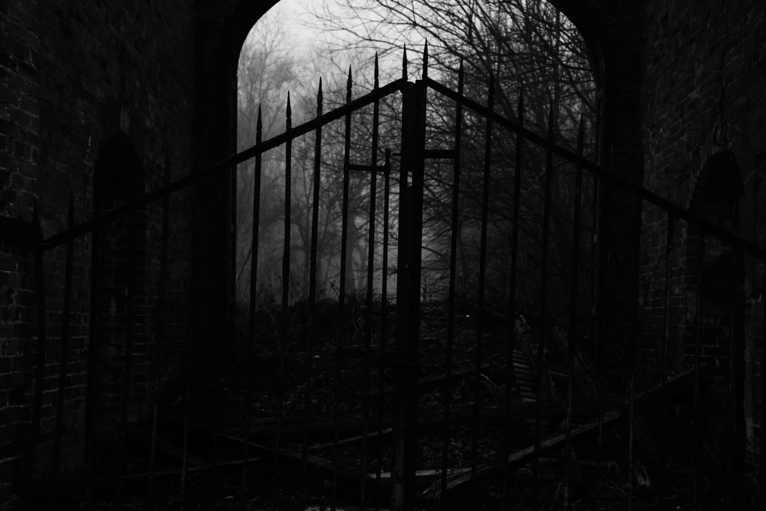
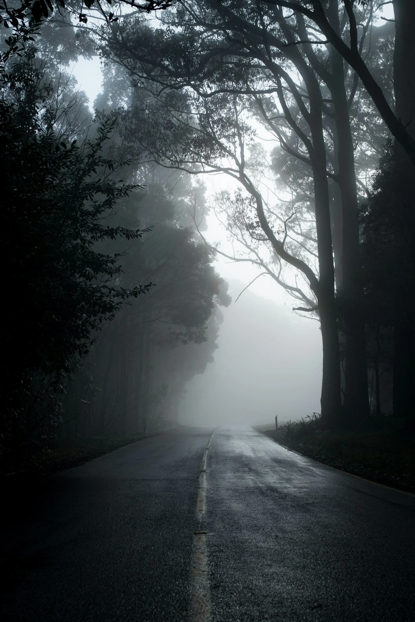
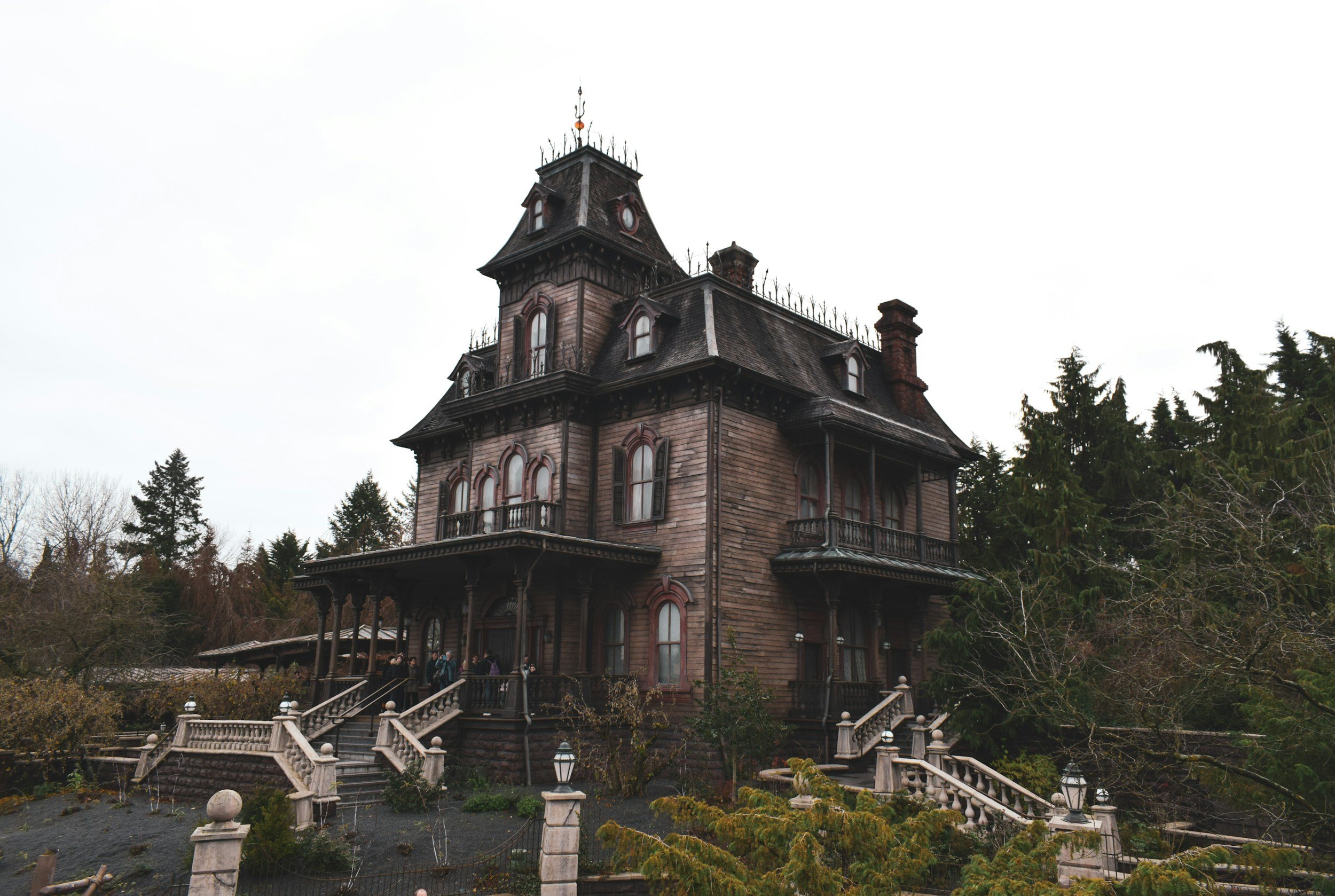
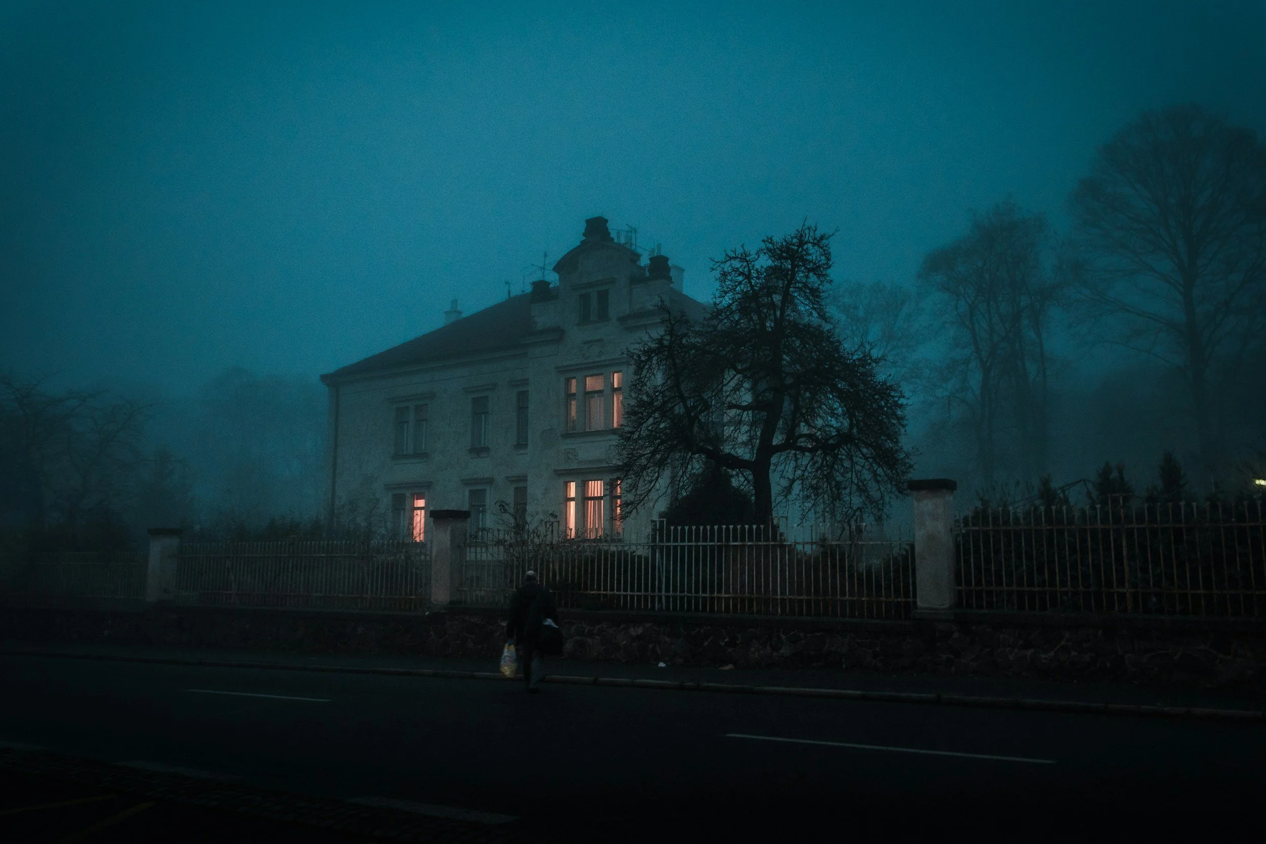
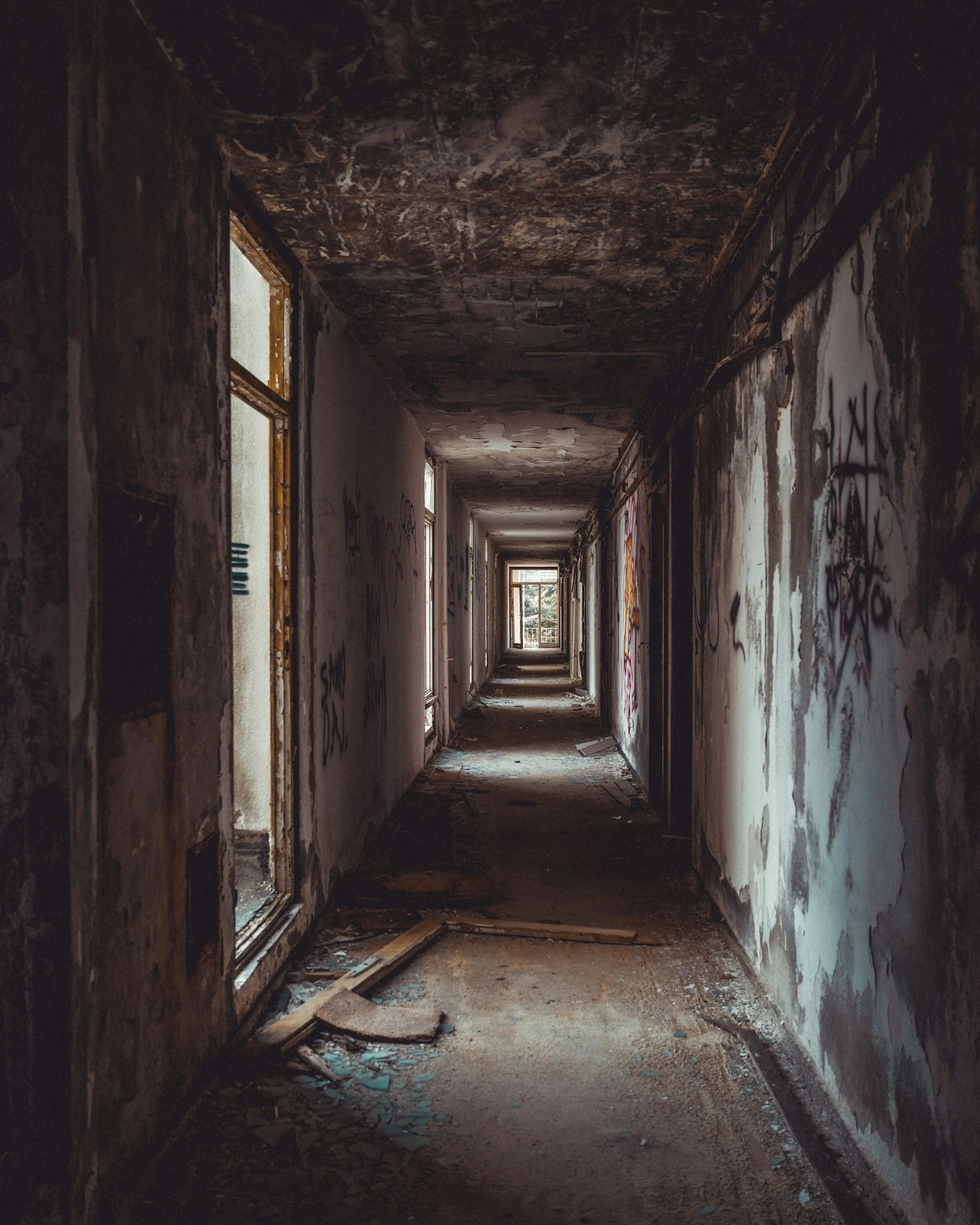
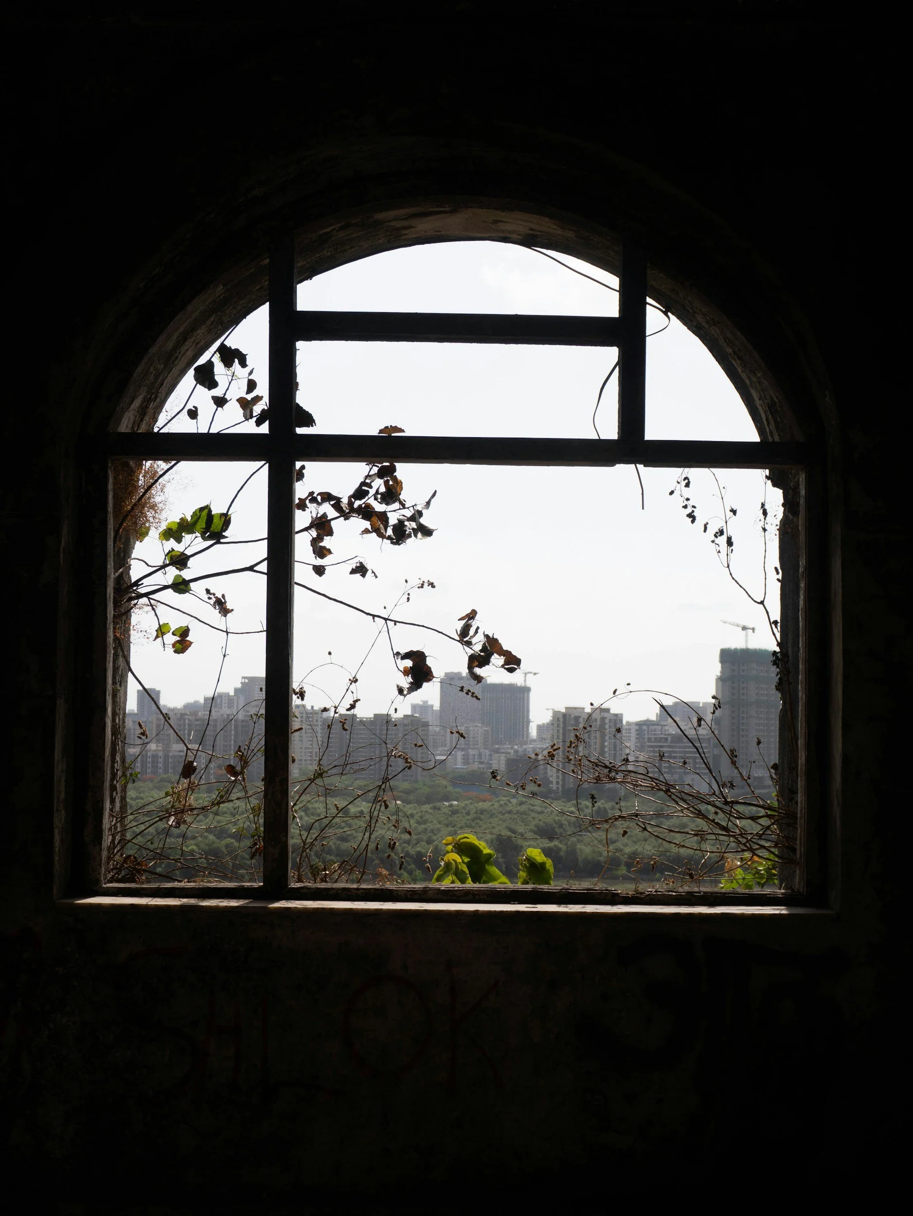
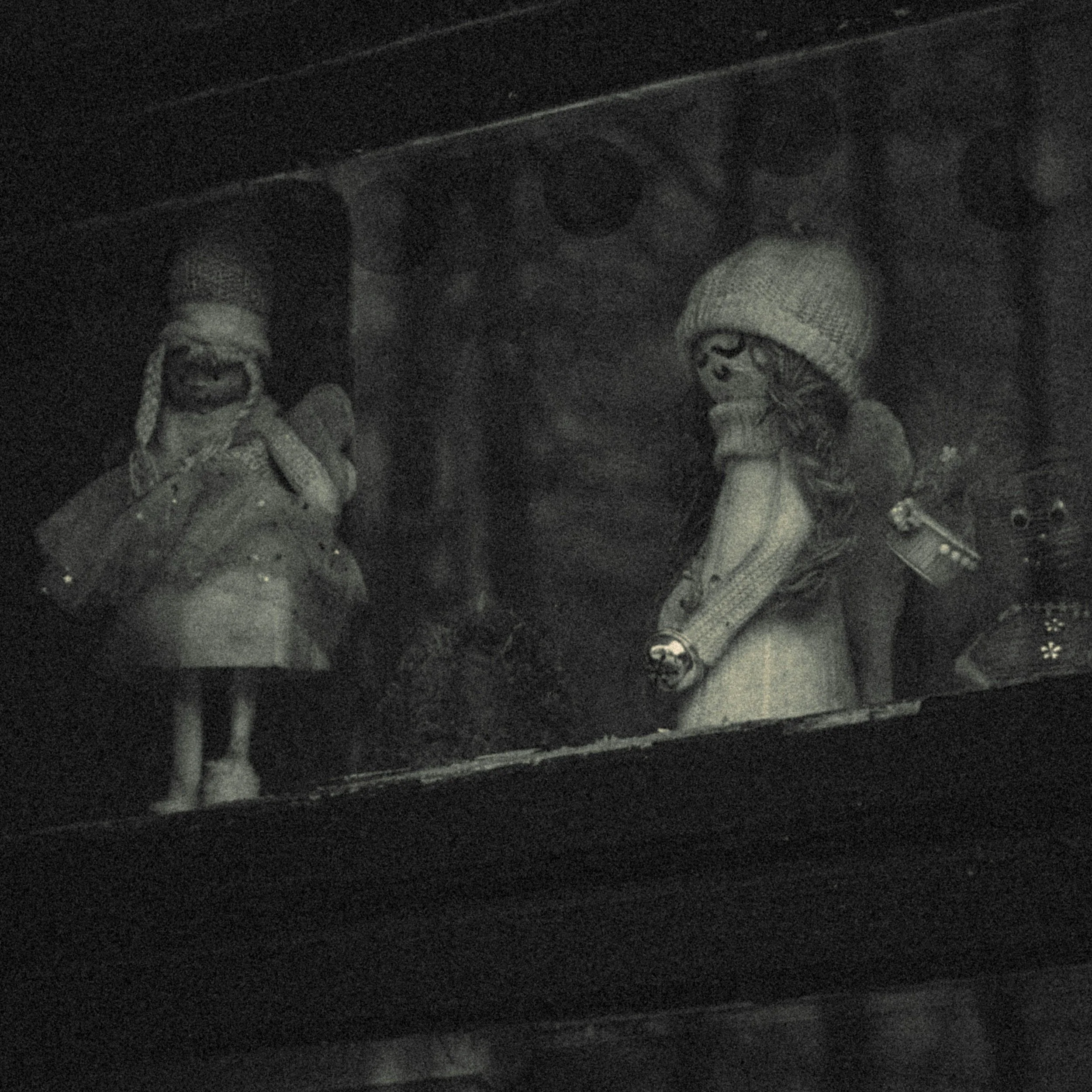
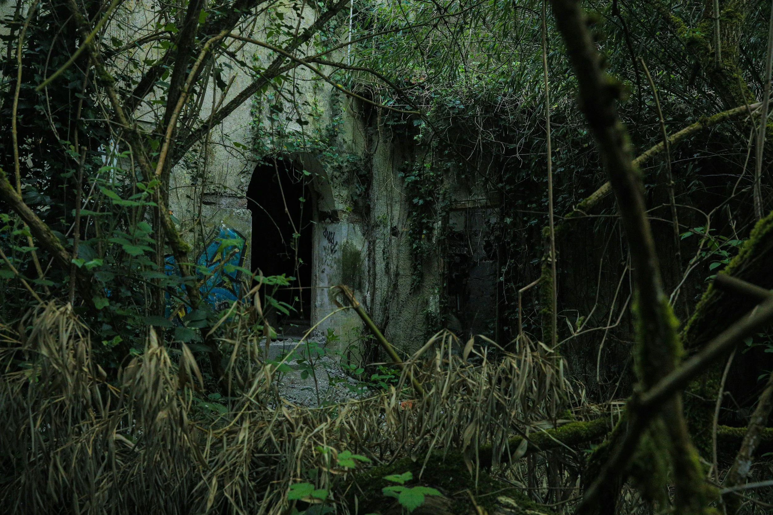
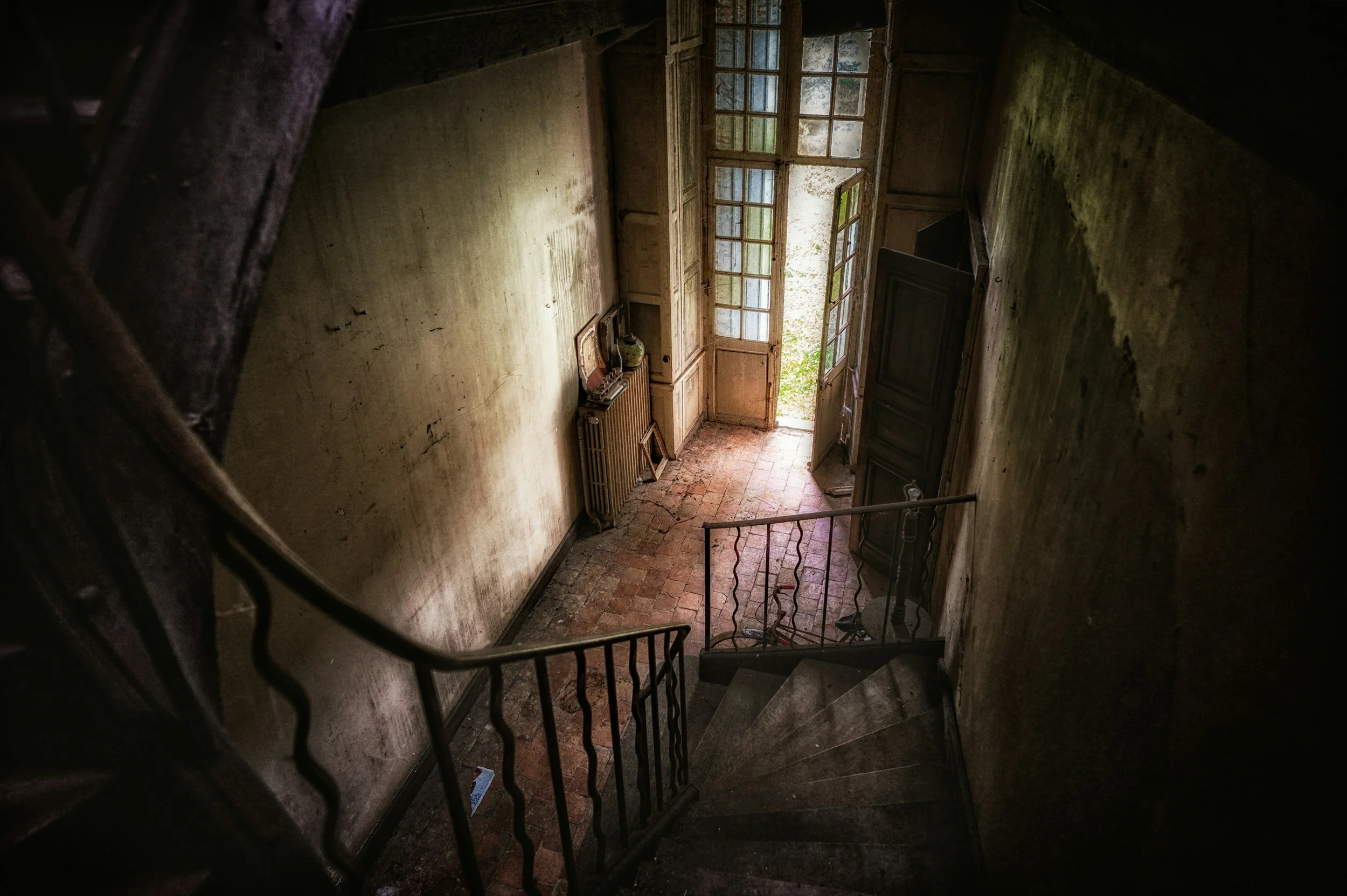
The vibe is eerie, nostalgic, abandoned, and chilling.
This version is less about romance and more about presence. Something was here. Something may still be here. The beauty has begun to decay. The house remembers. The room feels watched.
Search keywords we might explore (mix + match and see what you find!): overgrown greenhouse, peeling wallpaper, lace curtains breeze, dust motes, abandoned mansion, iron gates, antique mirror, empty hallway, cracked porcelain, old staircase, forgotten attic, fog through window, weathered door, abandoned garden

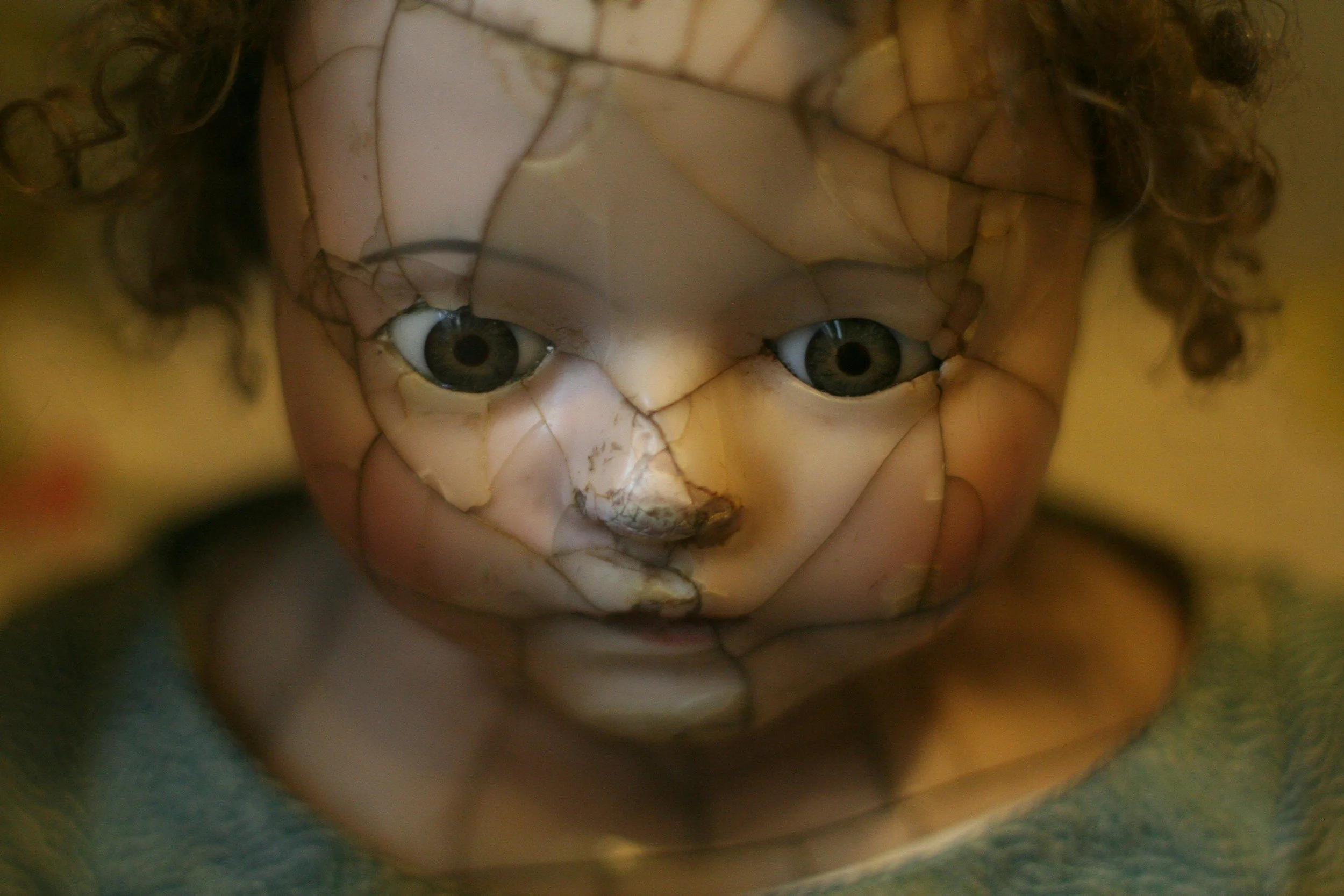
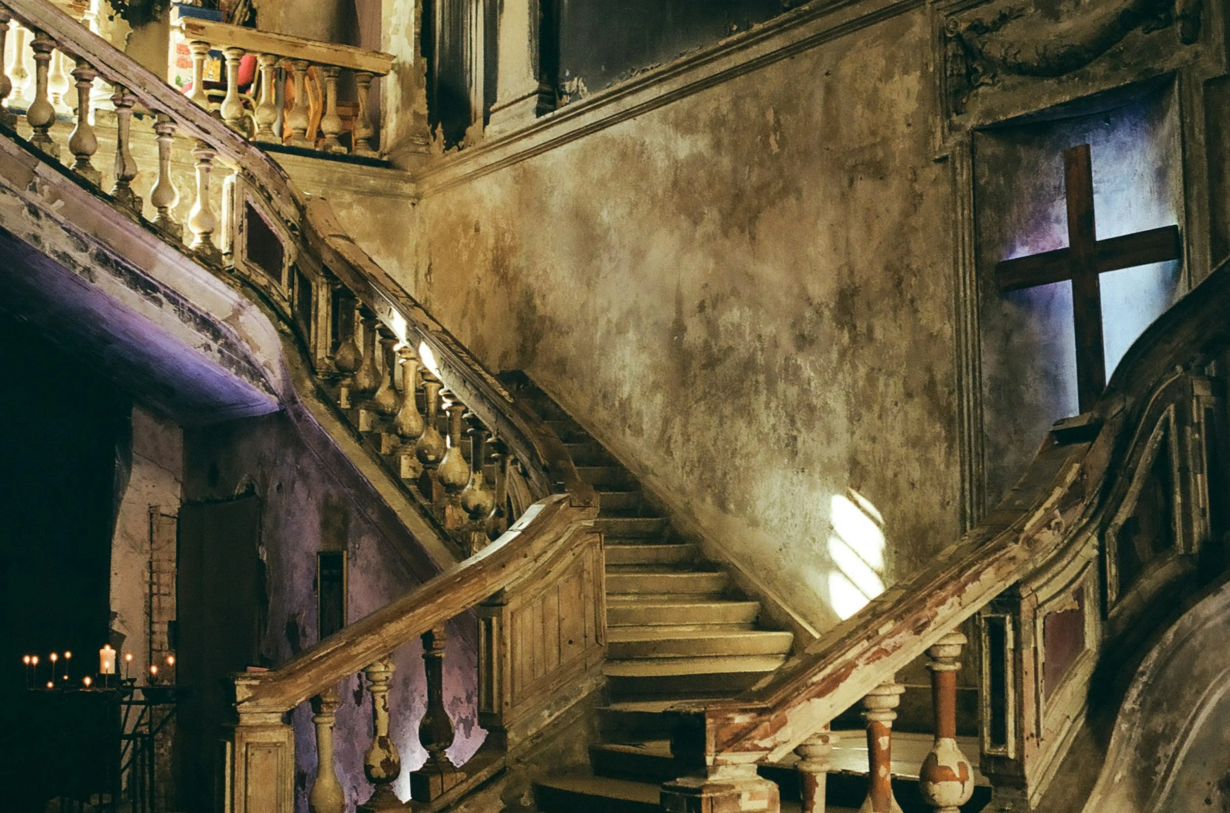
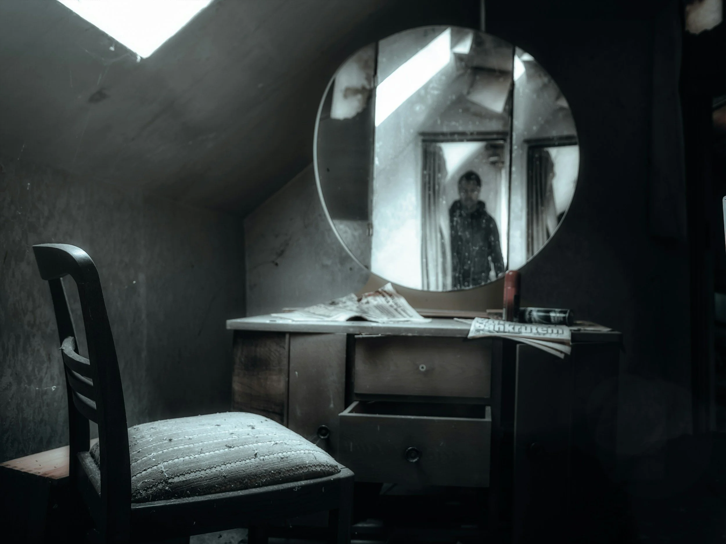
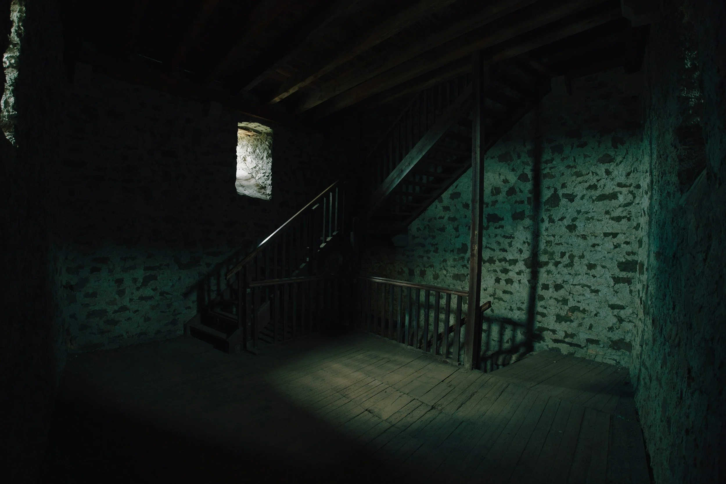
A note on visual bias: Stock photography is shaped by algorithms, trends, and cultural assumptions. As you curate, pay attention to who is represented, who is missing, and what kinds of beauty, romance, power, intellect, or adventure your images reinforce. Seek out diverse, respectful imagery when people appear, and be mindful of the cultural signals carried by objects, interiors, clothing, and settings too.
Gothic x Horror
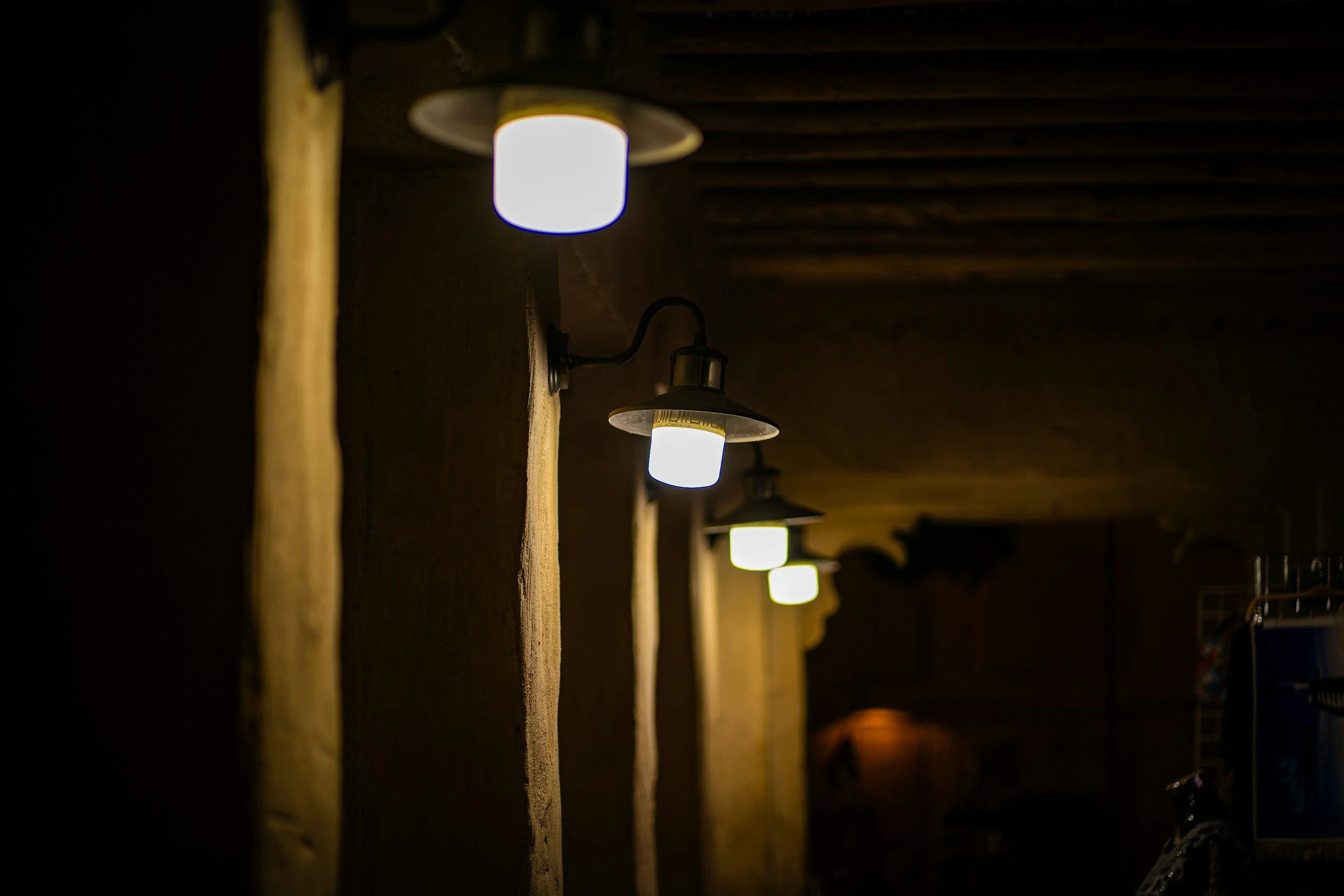
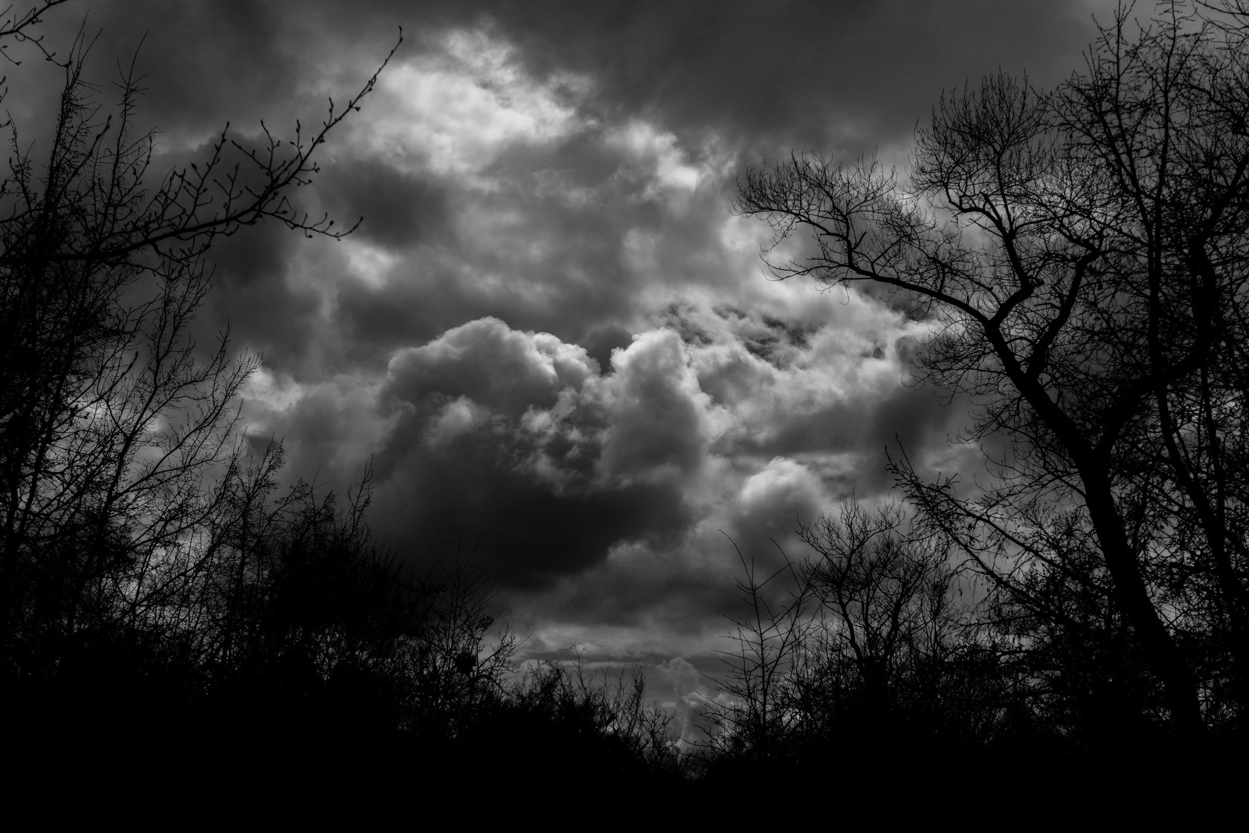
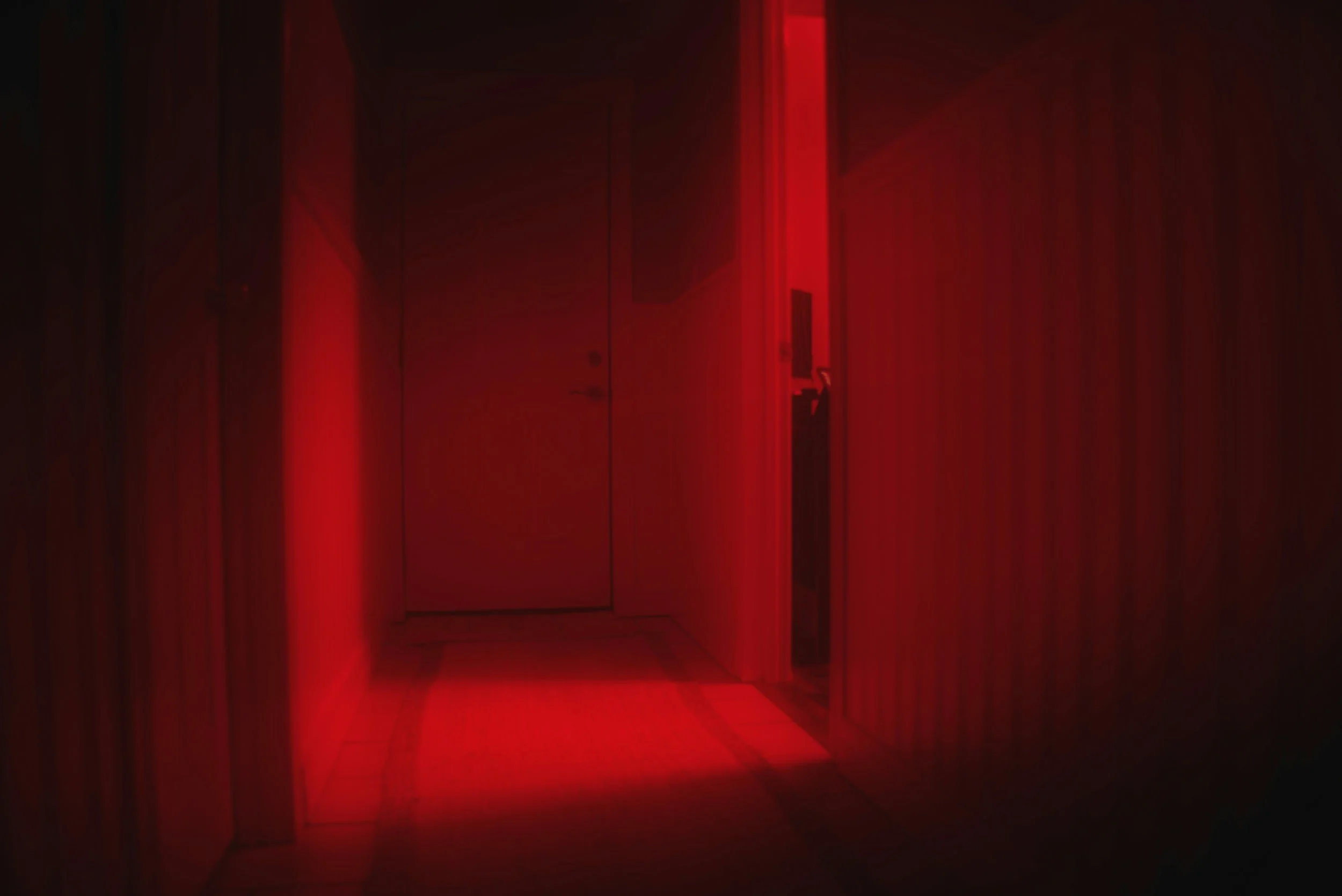
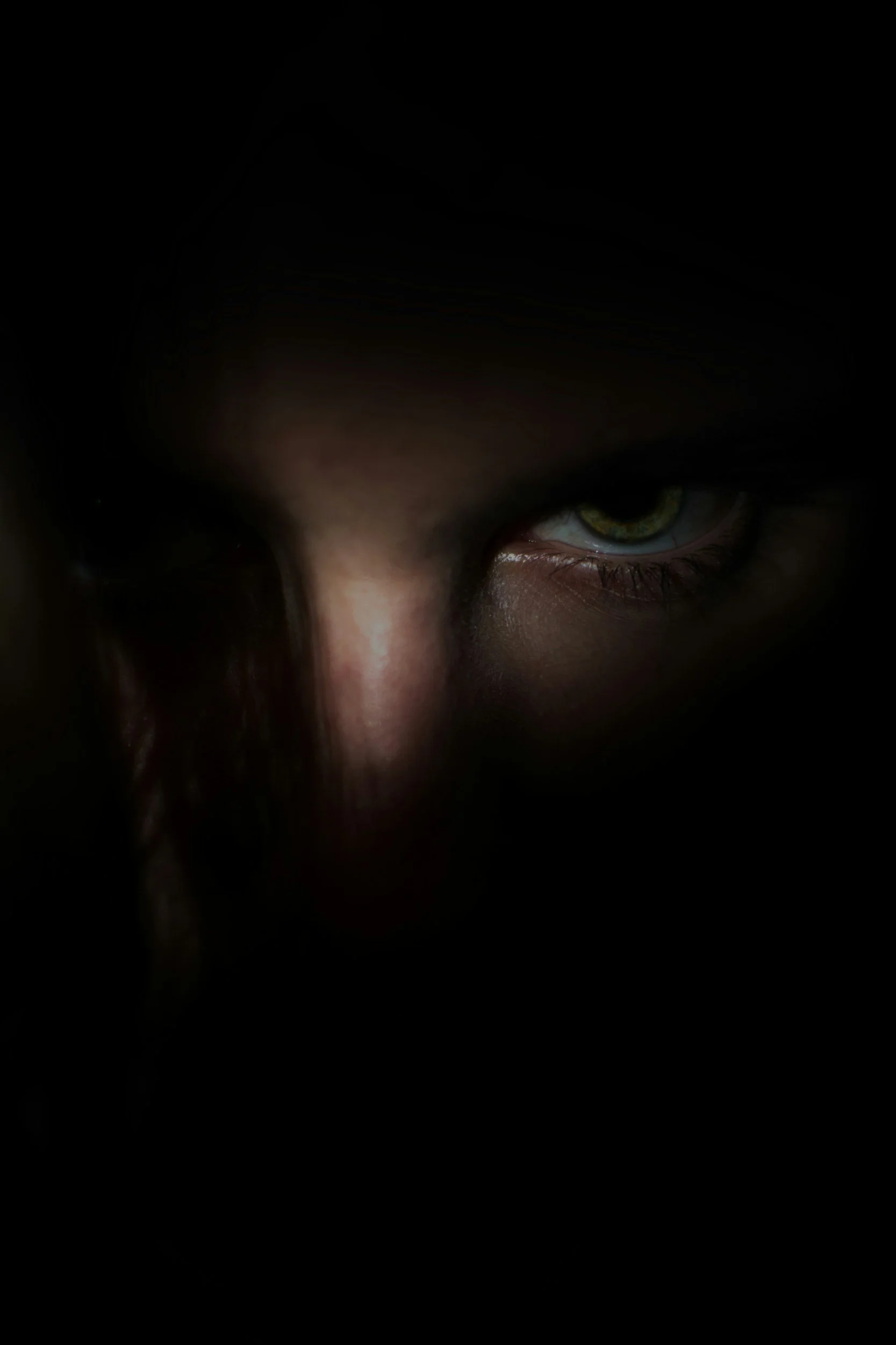
The vibe is visceral, threatening, shadow-drenched, and high contrast.
This version needs to have an edge. The mood is not only melancholy or mysterious—it carries danger. Look for contrast, distortion, stark light, unsettling details, and images that create tension before the viewer knows exactly why.
Search keywords we might explore (mix + match and see what you find!): chiaroscuro lighting, stark shadows, dead forest, ravens, spilled ink, broken glass, anatomical sketches, foggy woods at night, flickering candle, dark corridor, red fabric, cracked mirror, black branches, storm clouds, candle smoke, uncanny

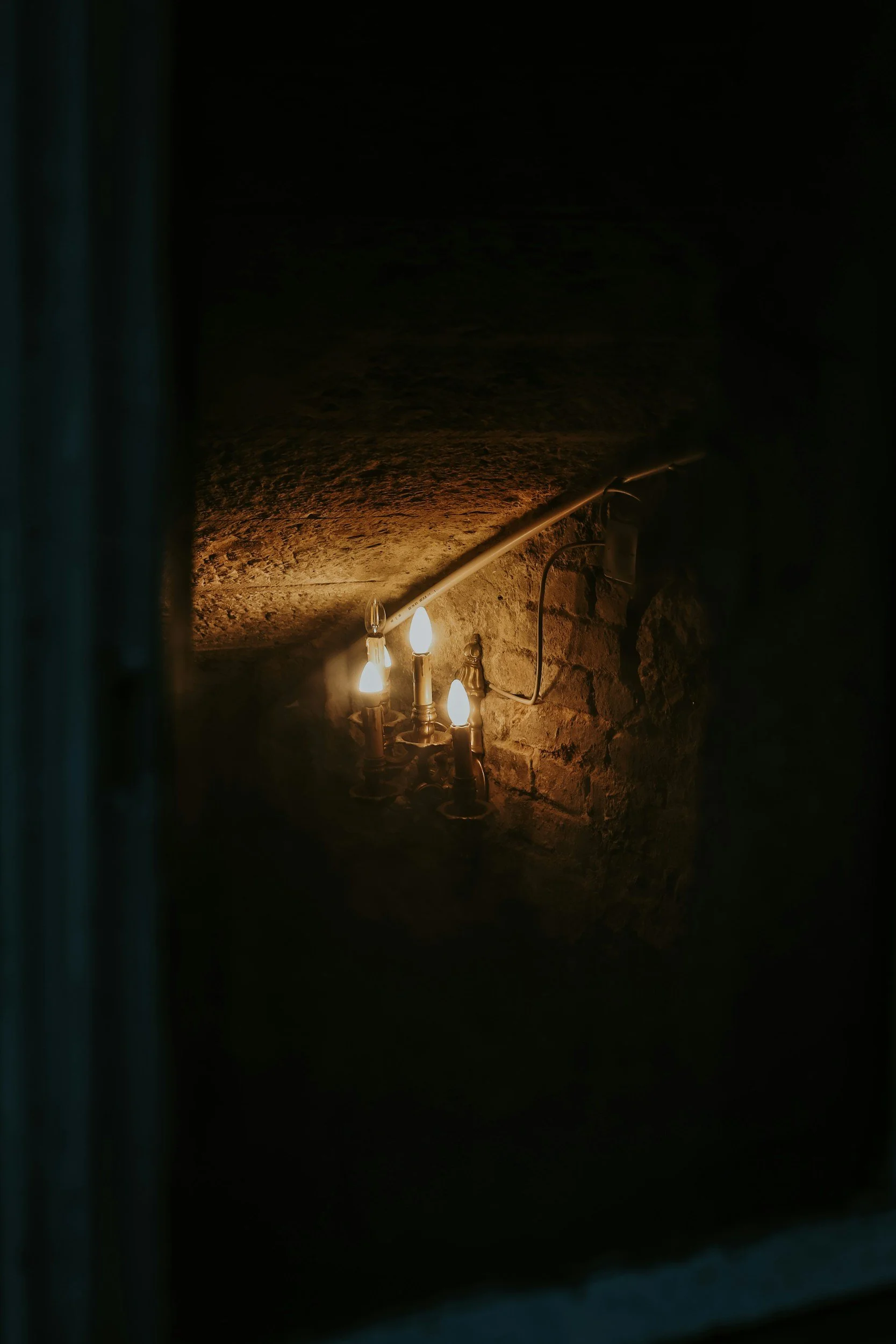
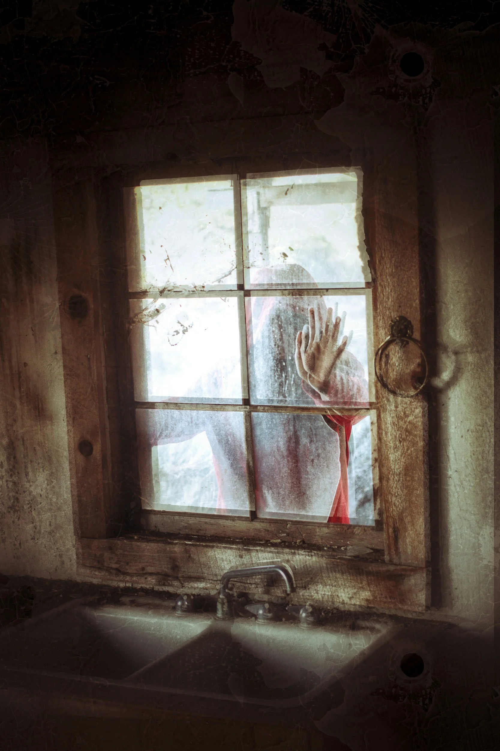
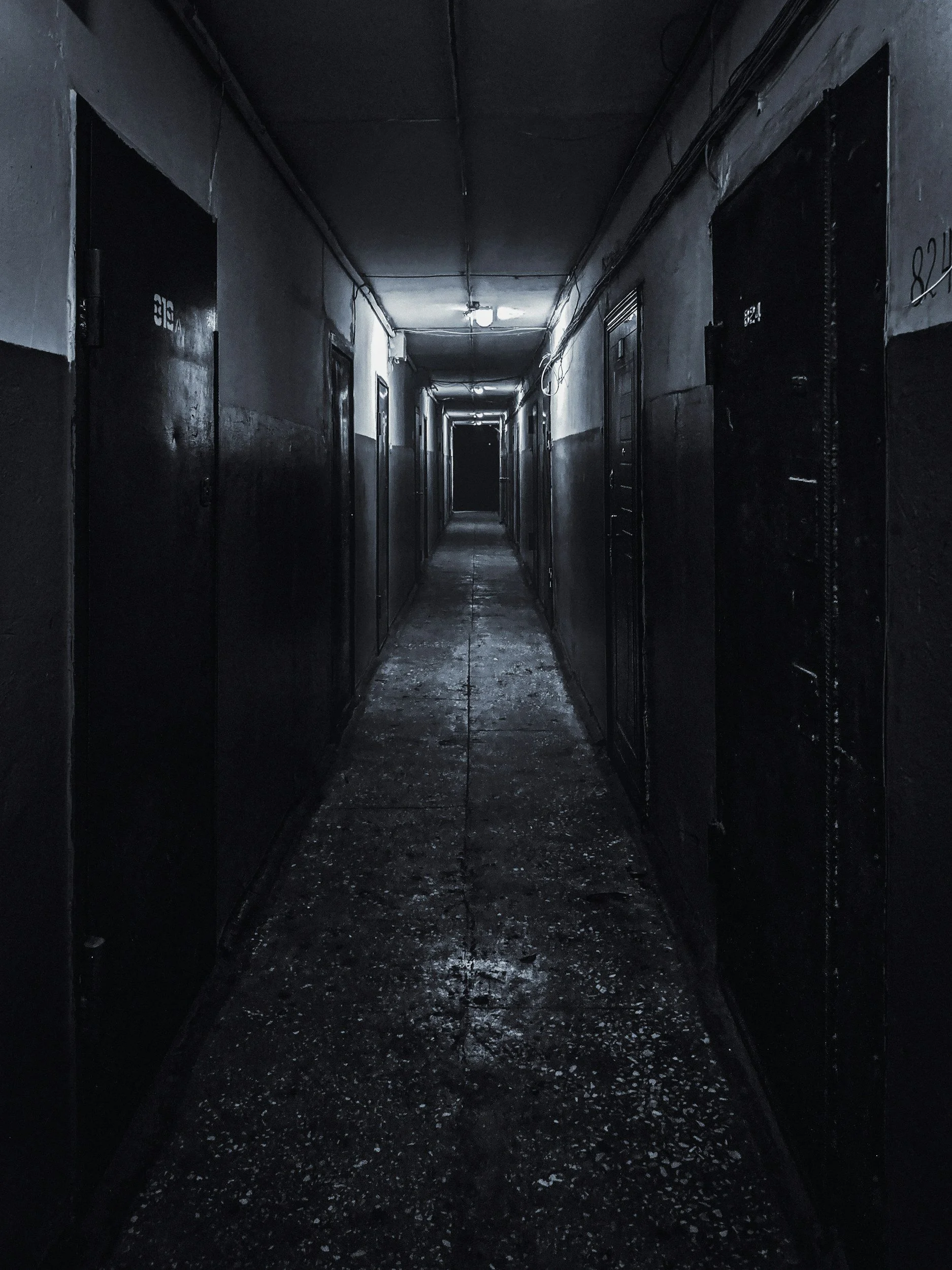
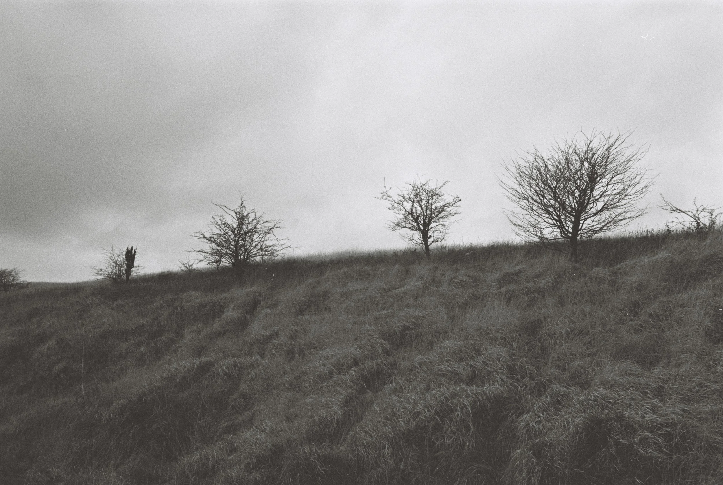
The more precise the phrase, the better the results. Instead of searching “romance author photos,” search for the visual world underneath the romance: “silk sheets morning light,” “wild roses,” “antique handwritten letter,” “gold mirror,” “pink dusk,” “pink velvet sofa.” Instead of searching “fantasy author,” search “misty mountains,” “ancient forest,” “mossy stone,” “moonlit lake,” “silver crown,” “overgrown ruins.” The image should not just label the genre. It should create the atmosphere.
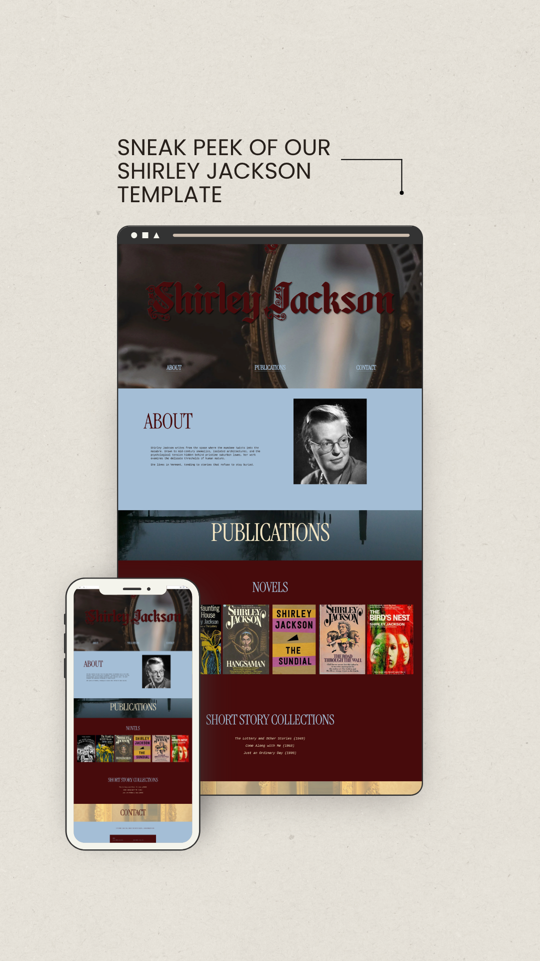
INTRODUCING AUTHOR WEBSITE TEMPLATES
Investing thousands into custom web development—like our Debut Writer or Seasoned Writer packages—isn't always feasible.
While a pre-made framework can never truly replace the deeply collaborative magic of custom design, you shouldn't have to settle for an uninspiring DIY site just to stay on budget.
Think in Mood, Texture, and Setting
A strong author brand usually has a consistent emotional landscape.
That doesn’t mean that every image has to look the same. In fact, using the exact same kind of photo everywhere will make your website feel flat and boring. But the images should feel like they belong to the same world.
When searching for photos, I like to think in three layers:
Mood
What should the reader feel when they arrive on your website?
Suspense? Intimacy? Wonder? Unease? Joy? Tension? Escape?
Mood gives the photo its emotional direction.
Texture
What materials, surfaces, and details belong to your world?
Velvet, linen, paper, fog, marble, woodgrain, lace, moss, glass, wildflowers, candle wax, leather, rain, dust, ink? Texture makes the brand feel tactile. It gives readers something they can almost feel in the body.
Setting
Where does the imagination naturally go?
A sunlit kitchen? A dark academia library? A foggy forest? A desert road? A coastal town? A ballroom? A greenhouse? A motel room? A moonlit garden? A cluttered room?
Setting gives the reader a doorway into your work.
When these three layers work together, your website imagery starts to feel intentional instead of decorative.
Image Curation Rules I Live By
There are no absolute rules in author branding, but there are a few guidelines I return to again and again.
1. Establish Your Color Palette
Start with a simple palette:
one dominant color
one supporting neutral
one accent color
For example:
burgundy, cream, and dusty pink
forest green, black, and gold
navy, ivory, and copper
lavender, charcoal, and silver
sage, linen, and soft peach
Once you know your colors, look for images that include at least one of them. Not every image needs to contain the full palette, but they should harmonize with it.
This is one of the easiest ways to make an author website feel cohesive. If your homepage banner is dark green, your blog thumbnails are pale pink, your newsletter graphic is bright orange, and your About page photo is icy blue, the site may start to feel visually scattered.
Color helps the reader understand the emotional world of your brand before they read a single word.
2. Avoid Stock Photos That Feel Too Literal
For author websites, literal stock photos can become predictable very quickly. You know what I mean… A hand holding a pen over a blank journal. A laptop beside a coffee mug. A stack of books with fairy lights. A person writing in a blank notebook.
These images are a wee bit overused. They tell the reader “writing” in the most obvious way possible. Maybe that’s your thing, but if it isn’t, look for images that capture the mood of your writing, the atmosphere of your books, or the emotional terrain your characters inhabit.
If you write coastal romance, you may not need a photo of a couple on the beach. You might seek windblown grass, a linen dress, sun on water, a porch at dusk, or two coffee cups on a weathered table.
If you write dark academia, you may not need a student reading a book. You might need old stone, green banker’s lamps, marginalia, wool coats, rain on windows, or a library corridor.
If you write horror, you may not need a shadowy figure in the woods. You might need a bare hallway, a flickering light, a red door, a staircase at night, or a close-up of cracked tile.
The less literal image often gives the reader more room to feel.
3. Match the Image to Its Location
Not every beautiful photo belongs in every part of your website.
A portrait-oriented image may be lovely on Pinterest but awkward as a website banner. A busy, detailed photo may work well as a blog thumbnail but become unreadable behind homepage text. A close-up texture may be perfect for a section background but confusing as a main hero image.
Before downloading a photo, think about where it will live.
Website Banners
For website banners, look for wide, horizontal landscape shots with negative space.
Negative space means the empty areas of an image: a blank wall, foggy sky, blurred background, open field, shadowed corner, or simple surface. This space allows your text to be visible.
If the image is too busy, the reader might struggle to know where to look first. Then they might close your website forever.
For banners, I usually search for horizontal images, simple compositions, atmospheric backgrounds, soft focus, empty areas for text, strong mood without too many competing details
Blog Images
Blog images can be more specific. Because they usually appear as thumbnails or header images, they can include more detail. Still, they should fit your broader brand palette and emotional tone.
A blog post about grief in fiction might use fog, bare trees, a dim room, or a close-up of hands rather than something overly literal.
Social Media Images
Social media images need to be clear at a smaller size.
A photo that looks beautiful full-screen may lose all meaning when cropped into a square or viewed on a phone. Look for strong shapes, recognizable focal points, and enough simplicity that the image still works quickly.
This is another reason I like curating a batch of photos at once. You can choose a few for the website, then save others for Instagram posts, Pinterest pins, X headers, newsletter graphics, or quote backgrounds later.
4. Test the Crop Before You Commit
A photo can look completely different on a desktop screen than it does on a phone. Many websites use responsive cropping, which means the image shifts depending on the reader’s device. What looks perfect on a laptop may cut off the most important detail on mobile.
Before you settle on an image, test how it crops on a desktop, tablet, on mobile, in a square thumbnail.
If you use Squarespace, you can adjust the focal point within the image uploader. This tells Squarespace which part of the image to prioritize when it crops across devices. If a face, a doorway, a flower, or another important visual element is cut off, adjust the focal point or choose a different image.
The best website images are flexible. They can survive a crop without losing their mood.
Naming Your Image Files for SEO
Search engines cannot understand images the same way people do. They rely on surrounding context, file names, alt text, captions, and page content to interpret what an image is about.
This means image file names matter.
Before uploading an image to your website, rename it with clear, descriptive keywords. Use lowercase letters and hyphens instead of spaces.
For example: IMG_0482.jpg would become gothic-romance-author
The file name should help search engines and humans understand what the image represents.
Writing Alt Text for Author Website Images
Alt text is not only an SEO tool. Its primary purpose is accessibility.
Alt text describes an image for people using screen readers or for situations where the image does not load. It should be accurate, concise, and useful. If the image is decorative, you may not need detailed alt text at all, depending on your website platform and how the image is being used.
For author websites, alt text should describe the image in context.
For example, if the image is a moody banner for a gothic romance author website, you might write: Foggy rose garden with dark greenery for a gothic romance author website.
If the image is decorative and does not add meaningful information, the alt text can be minimal or empty, depending on the platform’s accessibility options.
Try to avoid keyword stuffing like: gothic romance author gothic romance books gothic romance website gothic author brand
That does not serve the reader. It also makes the website feel less thoughtful. Better alt text is descriptive, natural, and grounded in what the image actually shows.
A Simple SEO Checklist for Author Website Images
Before uploading images to your author website, check the following:
Rename the file with relevant keywords.
Use hyphens instead of spaces.
Keep the file name clear and specific.
Add accurate alt text when the image provides meaning.
Avoid stuffing keywords into alt text.
Compress large images so they do not slow down the page.
Choose the right image dimensions for the placement.
Test crops on mobile and desktop.
Use images that match the page topic.
Keep the visual style consistent across the site.
Image SEO does not need to be complicated. It just needs to be intentional. :)
Legal and Licensing Considerations
Free to use does not always mean free to use for everything. This is where we need to be careful.
Many stock photos are fine for blog posts, website graphics, newsletters, and social media. But if you want to use a stock photo on something you intend to sell—like a book cover, workbook, paid template, merchandise, or promotional product—you need to check the specific license.
Pay attention to the difference between editorial and commercial use.
Editorial Use
Editorial use generally means the image can be used in content that informs, educates, or comments on something. Blog posts, articles, and journalistic contexts often fall into this category.
Commercial Use
Commercial use generally means the image is being used to promote or sell a product, service, or brand.
An author website can blur this line because even if you are not selling the photo itself, your website is part of your author business. That doesn’t mean you can’t use stock photos, but read the license carefully.
Also be cautious with images that include: recognizable people, private property, artwork, logos, trademarks, branded products, book covers, and celebrity likenesses.
If you plan to use a stock photo for a book cover, merchandise, ads, or anything with broad commercial reach, read the license closely. When in doubt, choose a paid stock site with clear commercial licensing or hire a photographer or designer.
Building an Author Brand Image Library
One of the best things you can do for your author brand is create a small image library. Instead of searching for a new photo every time you need a graphic, gather a curated folder of images that already fit your mood, palette, and genre. This makes your visual presence feel more consistent over time.
You might create folders like:
website banners
blog headers
newsletter graphics
Instagram backgrounds
Pinterest images
texture images
seasonal images
book launch graphics
author brand inspiration
This also helps you notice patterns. If every image you save includes mist, old houses, cream fabric, and dark green trees, that tells you something about the visual world of your brand. If your images are split between neon cityscapes and soft cottage gardens, you may need to clarify the emotional direction.
A good image library becomes a creative resource. It saves time, supports consistency, and gives your author brand a visual foundation you can return to again and again.
A Quick Photo Curation Workflow
If you’re starting from scratch, try this:
Define your brand mood. Choose three to five words that describe the emotional experience of your writing.
Choose your color palette. Pick one dominant color, one neutral, and one accent.
List your genre-specific keywords. Think in mood, texture, setting, and objects.
Search beyond the obvious. Avoid only using broad terms like “writer,” “book,” or “romance.”
Save generously. Curate a few dozen images before making final choices.
Sort by use. Separate banners, blog images, social graphics, and textures.
Check the license. Especially for anything connected to sales or promotion.
Rename files before upload. Use clear, keyword-rich file names with hyphens.
Add thoughtful alt text. Prioritize accessibility and accuracy.
Test on mobile. Make sure the image still works when cropped.
This process gives you enough structure to stay focused without stripping away the creative part of the work.
Your website images should feel like a threshold
They should allow readers step into the emotional atmosphere of your work before they ever reach the first paragraph. They should support your genre, deepen your brand, and create a sense of recognition across your website, newsletter, and social media.
The best author brand imagery feels intentional, cohesive without being repetitive, and evocative without being too obvious.
It gives the reader a feeling to follow.
And when the images are chosen with intention + care, they help the right readers recognize that they have arrived somewhere meant for them. Which is exactly what we want.

Tiffany Grimes (she/they) is the founder of Burgeon Design and Editorial, a queer founded boutique editing and design house for brave creatives. At Burgeon, we specialize in book editing, coaching, and web design for the individualists, nonconformists, and trailblazers of the literary world. If you’re a maverick, outsider, rebel, renegade, dissenter, disruptor, or free spirit, you’ve come to the right place.
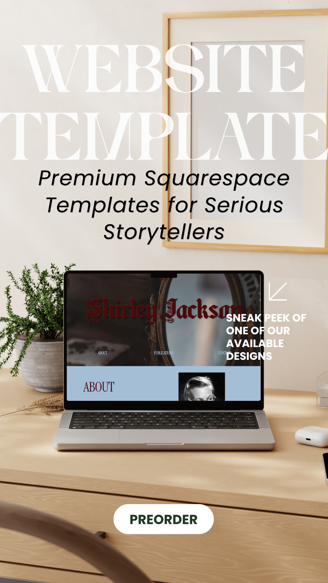
INTRODUCING AUTHOR WEBSITE TEMPLATES
Investing thousands into custom web development—like our Debut Writer or Seasoned Writer packages—isn't always feasible.
While a pre-made framework can never truly replace the deeply collaborative magic of custom design, you shouldn't have to settle for an uninspiring DIY site just to stay on budget.