CASE STUDY
Sawyer Elliot
PEN NAME OF TIFFANY GRIMES
PROJECT TYPE
Branding & Web Design
SERVICES PROVIDED:
Branding Design
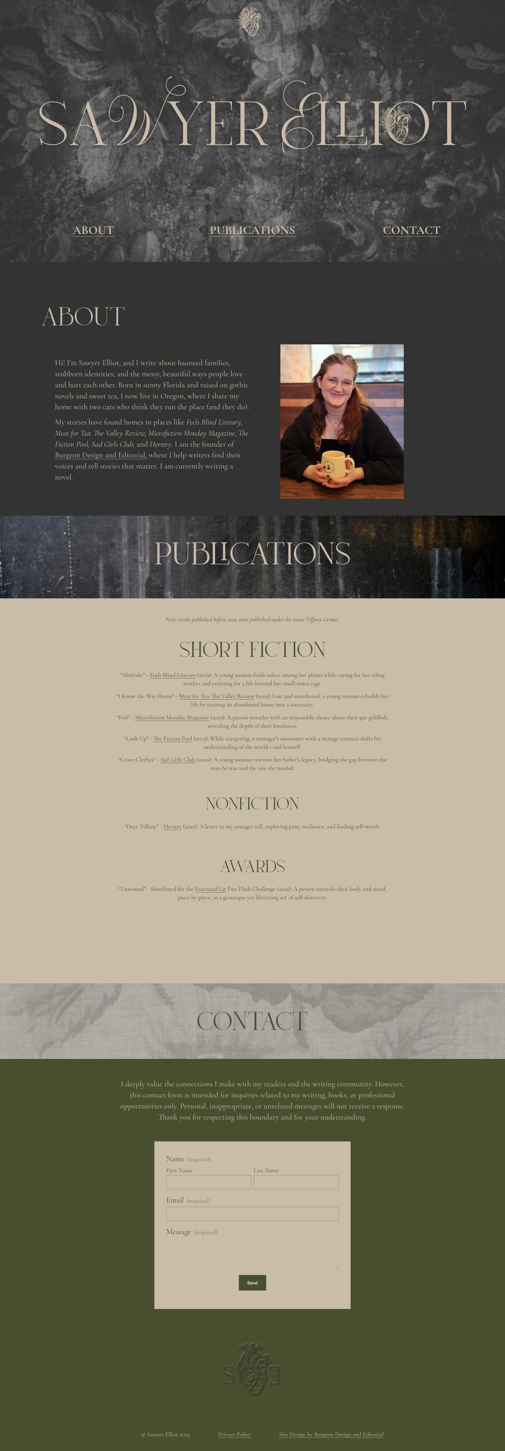
Squarespace Website
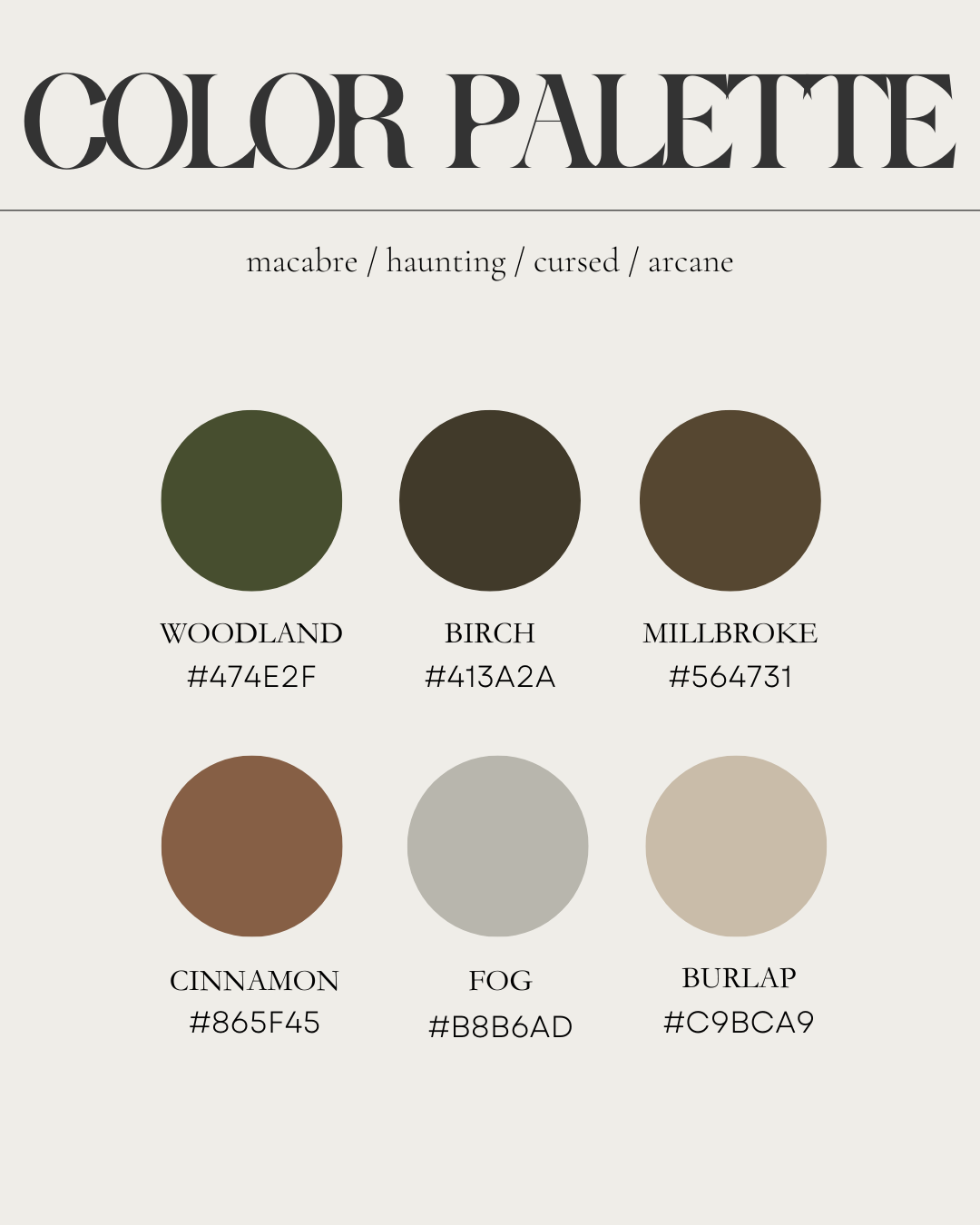
TONE
MACABRE
HAUNTING
CURSED
ARCANE
VISIT WEBSITE:
INSPIRATION
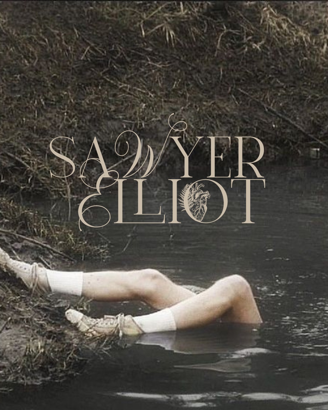
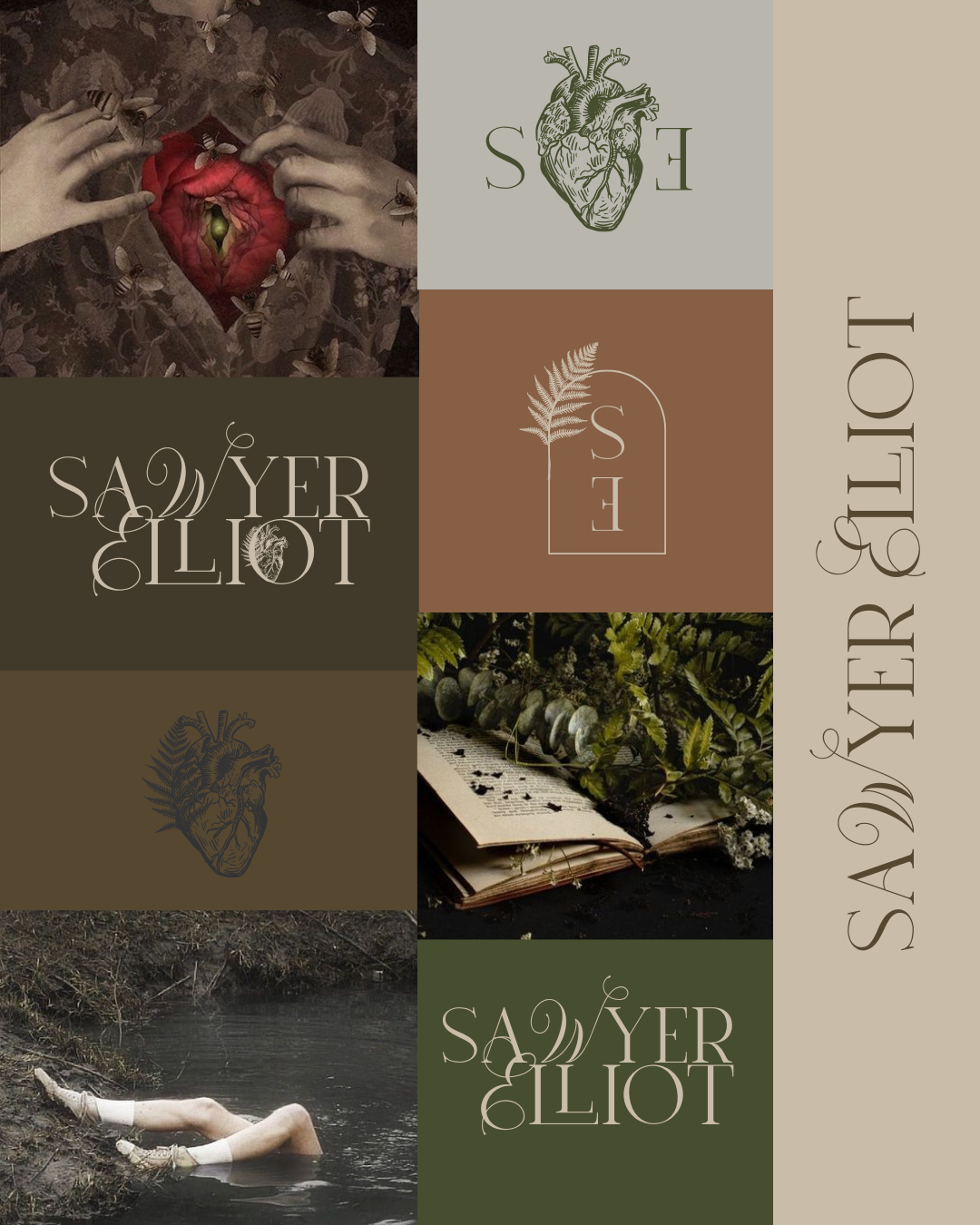
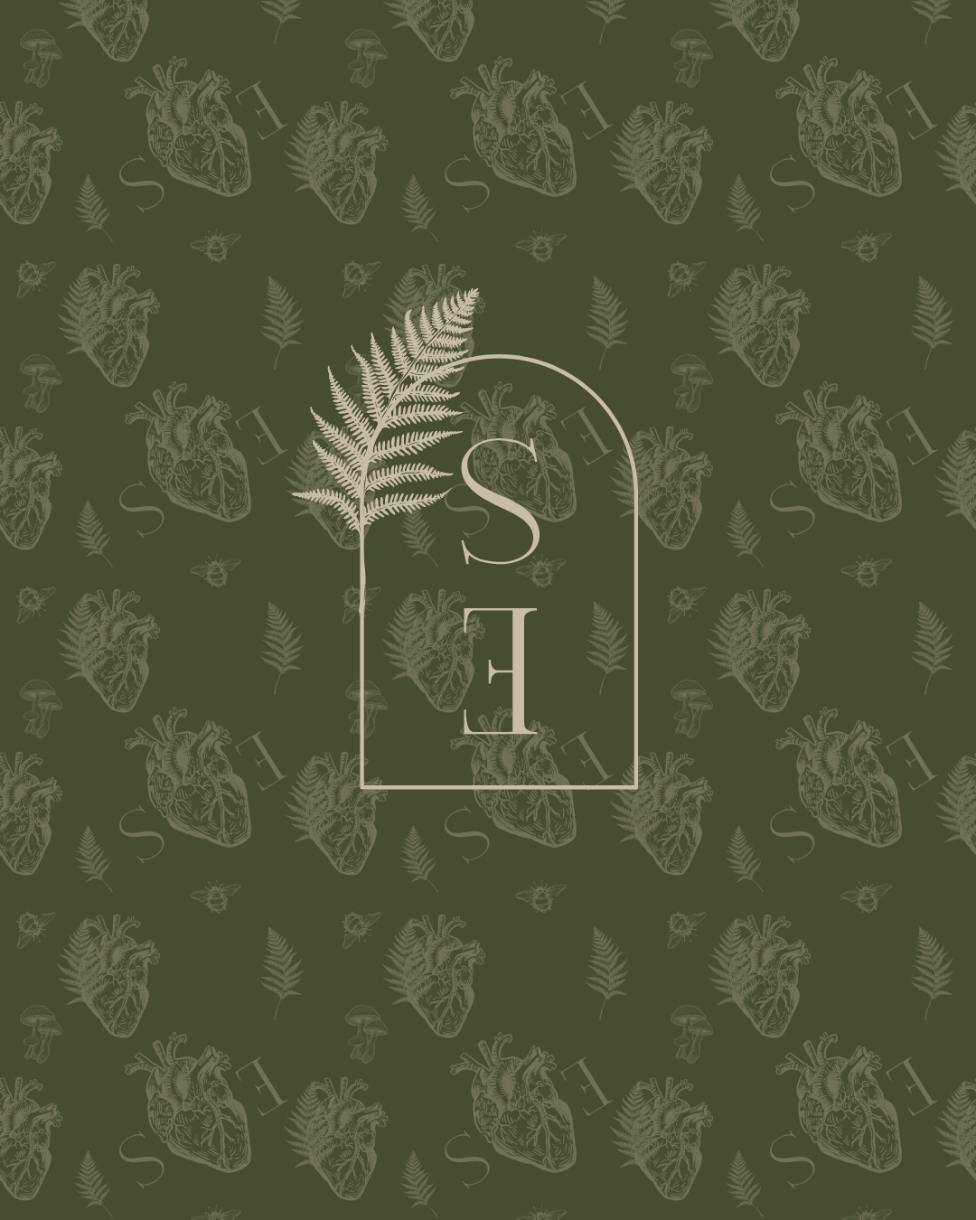
I wanted my own author branding to capture the haunting, arcane essence of the queer spec fic I write under my gender-neutral pen name, Sawyer Elliot. The palette—woodland greens, rich browns, and muted earth tones—reflects a world both grounded and otherworldly. My logo, an anatomical heart entwined with a fern, symbolizes the delicate balance between life and the supernatural. The typography strikes harmony between the masculine and feminine, a subtle nod to my nonbinary identity. Every element of this design is an extension of the stories I tell—macabre, intimate, and touched by the unknown.

BROWSE MORE CASE STUDIES